Dedicated to covering the visual arts community in Connecticut.

Thursday, March 13, 2014

Lindroth photography exhibit opens at Giampietro Gallery on Orange Street Fri., Mar. 21

Giampietro Gallery—Works of Art
91 Orange St., New Haven, (203) 777-7760
Linda Lindroth: Recent Disturbances
Mar. 21—Apr. 19, 2014.
Reception: Fri., Mar. 21, 6—8 p.m.
Artists' Talk: Sat., Apr. 5, 2 p.m.
Press release from Giampietro Gallery

Fred Giampietro Gallery is pleased to announce an exhibition of new works by Linda Lindroth. This exhibition will be Lindroth’s second solo exhibition with the Gallery and is entitled Recent Disturbances. The shows will be on view from Mar. 21—Apr. 19 at the Orange Street location, with an opening reception on Fri., Mar. 21, from 6—8 p.m. and an artists' talk on Sat., Mar. 15, at 2 p.m.

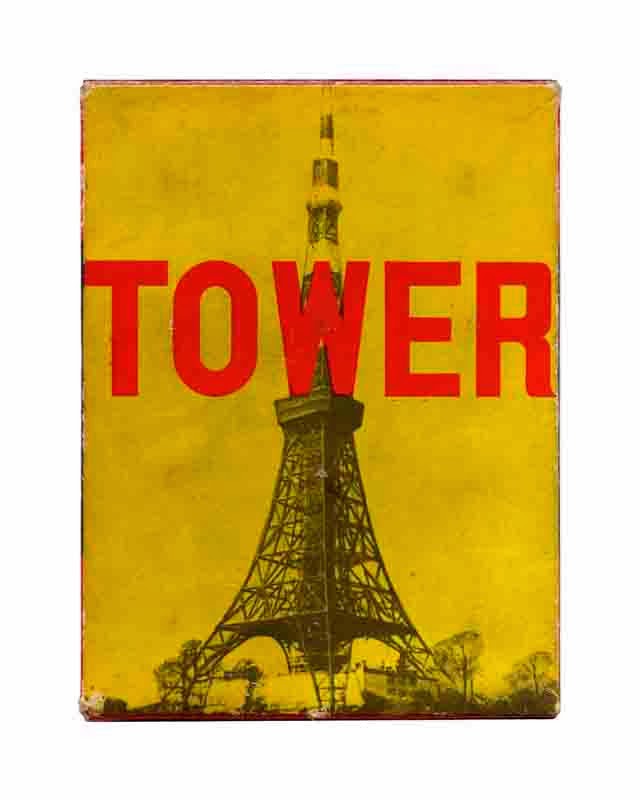
Lindroth’s large-scale work utilizes vintage packaging and ephemera as a source. The artist manually manipulates, digitizes and prints these objects over-sized, creating a situation where they are taken out of context. All work is printed on archival Epson Hot Press Natural and presented allowing the paper to float in the frames.

Linda Lindroth: "Tower"

Lindroth’s artworks are included in many important public collections including the Museum of Modern Art and the Metropolitan Museum of Art in New York, the High Museum in Atlanta, the Princeton University Art Gallery, and the Bibliothèque Nationale in Paris. She has won numerous grants and prizes including ones from the Connecticut Commission on the Arts, the Foundation for Contemporary Performance Art, The National Endowment for the Arts, The New England Foundation for the Arts, and the Architecture League of New York. She earned her Master of Fine Arts degree from Rutgers University and is an adjunct professor at Quinnipiac University.

Labels: , ,

Wednesday, October 16, 2013

Visits at Erector Square during CWOS 2013 first weekend

Artspace
City-Wide Open Studios
50 Orange St, New Haven, (203) 772-2709
City-Wide Open Studios 2013
Erector Square Weekend: Sat. and Sun., Oct. 12–13, Noon—5 p.m.

For the first time in a long time I was able to visit Erector Square both days of the weekend. And one of the truisms of City-Wide Open Studios, at least for me, is that these annual visits confirm a picture of artists as individuals who are always exploring, experimenting, searching for new ways to express themselves.

My first stop on Saturday is Building 4, more of an alternative gallery space than an actual open studio. Eight artists are showing work here and I take the opportunity to chat with several of them.

Will Lustenader is showing his most recent paintings. They mark a departure from the realist style with which I have been familiar. Lustenader says that they are the fruit of a two-year burst during which "I kept to myself and reinvented my approach to spatial issues."

When I had last checked in on Lustenader's work, he was painting still life’s of folded paper, exploring reflection, light and shadow along with the dynamics of shape. With the new work, Lustenader is taking the shapes and planes and eschewing reflective surfaces in favor of an approach more akin to color field painting.

They have a jaunty modernist groove—curves, angles, vessel-like figures. Lustenader says that someone on Facebook referred to the paintings as "visual Brubeck," a nod to the late jazz pianist Dave Brubeck. "God, I love that," Lustenader exclaims. "I'll keep that in mind when I'm painting—'visual Brubeck.'"

Will Lustenader: "Interactivity and Gifting," left and "Customary Regard," right


Lustenader sees this body of work as actually two different sets of pictures, which he approaches in very different ways. In some, the colors, even when layered, feel more solid and defined. Others more clearly evince process, the layering of light and dark pigments. There is also a combination of clearly hand-defined irregular edges versus other juxtapositions that are tight and masked-off from each other.

"I like the language, the flip-flop. It keeps me fresh, it keeps it fresh," says Lustenader.

I ask Lustenader how his work evolved to this current incarnation.

"I started to see shapes as shapes and not as atmosphere. As my tabletop became less reflective, things flattened out more," he explains.

But it also involves a revisiting of an earlier approach to painting, albeit in a new way. Lustenader says he felt he had "unfinished business from 1992 when I left off with very large color field paintings. But where his previous work in this mode was very conscious, "This I'm trying to do unconsciously."

"Sometimes I discover something in a painting by accident and then I use it purposefully" in subsequent works, Lustenader says.

•••

A glance at Karen Dow's new paintings might give the impression that nothing has changed. But for Dow, a fundamental shift has occurred over the past year or so in how she works. Where Dow used to paint in a kind of representational abstraction—interpreting photographs into their starkest pictorial elements as rectangular shapes—she has now abandoned referencing representational imagery.

All the paintings are made flat on the table. Dow turns the table as she works; the orientation of the image is not decided until the very end.

"It feels like now my work is focused more on composition and color and me holding off on that understanding of what I'm making," says Dow. "When I'm working from a photograph, I know how to solve that puzzle earlier." Her new approach makes the process more interesting, more mysterious. "It's less about interpretation and more about inspiration."

"I don't choose the palette ahead of time. I'm experimenting with color relationships. I'm more inspired by Josef Albers' color studies. There are lots of layers in these paintings and I'm adding and editing all the time," says Dow.

Dow teaches printmaking at the Educational Center for the Arts (ECA) and says the process of printmaking freed her up to experiment with the new approach. "In the process of teaching students monotype, I realized there was something there for myself. It literally happened in a class demonstration," Dow recalls. "I've always been interested in crazy quits—that process—but I've never seen a way in, how that influence would play in my own work. Pulling paintings off the wall and making them on the table made it possible to mimic that process in painting."

Karen Dow: Untitled monotype print


Along with the paintings she is exhibiting, Dow is showing a selection of monotypes. Like her paintings, they are based on rectangular shapes. The same thought process is evident but the transparency of the monotype inks allows the layering process to be foregrounded. (In her paintings, that layering is visible along the edges of her rectangles where traces of underlying colors remain as edge and boundary and history.) They remind me of aerial views of cities but with a twist—as though the viewer can see not only the current urban layout but also archaeological remains beneath.

•••

Dow's husband Chris Mir is showing a series of paintings of poppies on the adjacent wall. Mir tells me that a Carl Jung quote from Dreams, Memories and Reflections—"Birds, crystals and flowrs are God's thoughts"—lingered in his mind when working on the series.

"I liked that it was a flower that produced opiates. I have an interest in hallucinatory states," Mir tells me. The small, square paintings are "meditations on the beauty of forms." The luminous flowers open out of rich black backgrounds. "I think they're cosmic, as a child of hippies."

"I love the geometries of the internal structures," Mir says. He worked from photographs, painting with acrylics on panels. "They're kind of ugly and beautiful at the same time."

Christopher Mir: "Poppy 13"


When I ask if he has a favorite of the poppies, he pretty quickly chooses "Poppy 13" because its pistil and stamens are "weird browns and ochre’s, not traditionally beautiful. The immediate thing is they're flowers and beautiful but also sinister and alien."

•••

Rebecca Lowry has been painting on wood since she was a child. Her father was a builder and there was always plywood lying around. "It was unintimidating and cheap," she tells me, "and I got attached to the feeling of painting on a hard surface."

But it has just been in the past year and a half that Lowry has started not only painting on wood but carving the surface as well. She carves into the surface and adds layers on top and layers behind, saying it's a "back and forth process."

Rebecca Lowry: "Hide Here With Me"


"I think I wanted to make a mark. I pounded something into the surface of the wood and it occurred to me I could alter the surface," Lowry says. She started out with finer tools and found her way to power tools like angle grinders and disc sanders. "I like making art with something aggressive," she says, laughing.

"I don't start out with the intention of a shape or feeling. I let the process dictate the starting point. I get attached to something in the composition and then starting working around that," Lowry says. "Something starts to reveal itself and then I push that."

Rebecca Lowry: "Hide Here With Me" detail


Of course, the drawback to carving in wood is that it locks her down. As a way to get some relief from that, Lowry also works on paper, taking rubbings off the surface of some of her carved pieces and then embellishing those images. Paper frees her up. "Paper is calmer, more serene," Lowry says.

•••

Also showing fine work in that space were Joseph Fucigna, Danny Huff, Cham Hendon, Peter Ramon and Linda Lindroth. I've written before about Lindroth's large photographs of packaging material. The images in that series that she had previously shown were often devoid of references as to what exactly they were, reading as geometric modernist abstractions. Lindroth is now allowing recognizable representational imagery into the frame—packaging art, text.

"They are going in a variety of directions," she tells me. "I'm trying not to limit myself."

•••

In Building 6, I visit with Nancy Eisenfeld, Barbara Harder, Liz Pagano and Fethi Meghelli. Meghelli was showing a number of works in progress, including ornate handmade dolls inspired by a visit to his native Algeria for a relative's wedding. The dolls are crafted out of aluminum foil, clay, recycled materials like bottles and cans, and cloth remnants he finds.

"I'd never seen a wedding like this. It was so elaborate," Meghelli says. "I found out UNESCO has decided [this community] is a World Heritage site to be preserved. The dresses are a craft being passed from one generation to another. They really inspired me. I took tons of pictures."

Dolls by Fethi Meghelli


The dolls are not based on the pictures, per se. Rather, they served as a prod to Meghelli, the images being transformed by his artistic imagination into the colorful garb of his dolls.

•••

Also in Building 6, I stop in and visit with Jeff Mueller and Kerri Sancomb of Dexterity Press, a letterpress printing shop. Mueller, in between giving demonstrations to visitors of how his presses work, tells me that he originally got involved with letterpress printing as a way to come up with creative packaging for records made by post-punk bands he played in. Mueller has recorded with the groups Rodan, Shipping News and June of 44. He started working in a shop in Chicago in 1995 and formally opened Dexterity Press with his wife Kerri Sancomb in 2001. In 2010, Mueller and Sancomb moved to Connecticut.

Jeff Mueller of Dexterity Press


Besides doing commission work, Mueller and Sancomb also design and print their own fine art posters and artist books. Their designs are based on found imagery, Mueller's own drawings and the use of hand-set type. There is a wonderful poetic feeling to their prints.

•••

On a tip, at the end of the day I stop by Building 3 to check out the drawings of Daniel Eugene. His incredibly detailed works evoke Op Art, antique engravings, natural forms, Art Deco and Art Nouveau. Eugene's relentless line work piles up detail upon detail, creating shimmering forms.

Eugene says he wants to "create a biological response so you feel it somewhere in your body rather than just witness it through your eyes."

Artwork by Daniel Eugene


Eugene says he is intrigued by "indigenous goddess images and pre-patriarchal society"—one drawing is called "Artemis's Bow"—but is most influenced by literature and, in particular, stream-of-consciousness writers such as Henry Miller, Anaïs Nin, D.H. Lawrence and Lawrence Durrell. It isn't surprising. His drawings have a meditative, stream-of-consciousness feel to them.

"Their concerns are not only about what they're creating but art as a power, a possibility—something that shapes progress," says Eugene. "To call yourself an artist is to take a huge responsibility. You really need to think about what in your present experience is absent from the social equation, identify it and allow your artwork to be a catalyst for that type of conversation."

•••

On Sunday, I wander through the Building 5 second floor space just browsing the work of the various artists there. Before I do, I spend some time on the first floor, acquainting myself with Gordon Skinner's mixed media paintings. The beauty of Skinner's artwork is the way it harnesses putatively ugly emotions and harsh truths—about racism, poverty, violence—to fashion a rough beauty.

Skinner, a self-taught 36-year-old African-American artist, has only been painting for four years. But in that time he has developed a strong command of his brushwork. Three current paintings on display—"Nomad: Circulatory Study 1," "A Study of Ciäte's Mother: Circulatory Study 3" and "Falling Nude: Circulatory Study 2"—are electric, filled with energy and excitement. Skinner layers paint with a sure eye. His most recent figurative work reminds me of the painterly approach of Francis Bacon.

Gordon Skinner: "Nomad: Circulatory Study 1"


"I'm trying to focus on my own artistic language," Skinner tells me. There are recurring motifs in his paintings: brick imagery relates to the urban environment, the "Greek key" represents the infinite. A lot of his figures are portrayed with their mouths wide open, Skinner saying it symbolizes his "need to be heard." He incorporates collage, bold colors. Skinner says he enjoys building up the canvas, that texture is an important part of his work.

Gordon Skinner: "Self Portrait as Garbage Pail Kid III" detail


"I love expressionist work, anyone who expresses themselves and has that freedom to be creative. I'm drawn to that," says Skinner. Among the artists whose work has influenced him are Joan Mitchell, Picasso, Francis Bacon and Joan Miró. The influences "act as a gauge. This is what this person did and did well. What if I turn over here? It gives me a range. I use that as schooling.

"The paintings are never finished, they're only abandoned," says Skinner. "It's pretty instinctual."

•••

My final stop is the studio of Geoffrey Detrani in Building 2. Detrani creates layered mixed media works that superimposes naturalistic and architectural forms. "It's the duality I'm always trying to get at in my work," Detrani says, "between the indication of a naturalistic space and something very artificial and manufactured." He relies heavily on acrylic medium, both as a glue with which to adhere his translucent layers of drawings and as a neutral tint.

Along with his larger paintings, Detrani is showing drawings built up over faint graphite layers. These drawings are "a record of making work," Detrani says. They begin as sheets of paper on top of which he is starting other pieces. Those drawings leave traces that have a ghostly quality. Detrani then superimposes additional imagery over those traces.

Geoffrey Detrani: "Homespun Fiction"


A recently finished work, "Homespun Fiction," incorporates pencil, acrylic, a photograph and enamel on paper mounted to a panel. It is somewhat unusual in Detrani's oeuvre for including a large bold area of color (yellow) as part of the work. His paintings tend to be characterized by a very muted color palette with some limited inclusion of strong red. Detrani says the work is an experiment in "trying to look for the thing itself, when separated out from all the special effects. When taken out of that atmospheric space, see how it works on its own with a color field behind it."

Labels: , , , , , , , , , , ,

Wednesday, February 06, 2013

Linda Lindroth talk at Kehler Liddell Gallery tomorrow during Photo Arts Collective meeting

Kehler Liddell Gallery
873 Whalley Ave., New Haven, (203) 389-9555
Talk by photographer Linda Lindroth at monthly meeting of Photo Arts Collective: Thurs., Feb. 7, 7 p.m.

Press release from Giampietro Gallery

Linda Lindroth will talk about her recent photographs, Trickster in Flatland at the monthly meeting of the Photo Arts Collective at the Kehler Liddell Gallery, 873 Whalley Avenue in New Haven, on Thurs., Feb. 7, at 7 p.m. The talk is free and open to the public.

Linda Lindroth is an artist, photographer, writer and Adjunct Professor at Quinnipiac University where she has taught courses about visual culture in departments including Women’s Studies, Interactive Digital Design, Fine Art and the University Writing Seminars for the past 15 years. She has a BA and MFA in Art from Rutgers University and her work is represented in the permanent collections of the Metropolitan Museum of Art and MoMA. She has exhibited internationally and has received Grants and prizes from the Foundation for Contemporary Performance Art, the Connecticut Commission on Culture and Tourism, the NJ State Council on the Arts, the Architecture League of New York, the National Endowment for the Arts, and the New England Foundation for the Arts. She is the co-author of Virtual Vintage (Random House 2002) Her recent photographs entitled, Trickster in Flatland were exhibited at the Giampietro Gallery in September, 2012. (See the Connecticut Art Scene review here.) Linda Lindroth is represented by FRED.GIAMPIETRO Gallery in New Haven, CT.

Labels: , , , ,

Thursday, October 04, 2012

Refusing to be boxed in

Giampietro Gallery—Works of Art
315 Peck St., New Haven, (203) 777-7760
Linda Lindroth: Trickster in Flatland
Closed.

Surface and not surface. Depth and depthlessness. Reality and illusion. Historicity and timelessness. Representation and abstraction.

Photographer Linda Lindroth is engaged in serious play in her show Trickster in Flatland, which just closed at the Giampietro Gallery in New Haven. Exhibiting 17 large images, all but a half dozen of which were made in the last two years, Lindroth disassembles a material reality to reassemble her own aesthetic vision.

In the literal sense, most of these photographs are of old cardboard boxes used to hold commercial products. Mundane, no? The corners of the boxes have either come part on their own—as is wont to happen with these types of objects over time—or been torn open by Lindroth herself. Stripped of their three-dimensionality, they are splayed open like mounted butterflies, a geometricity of flat processed color, torn edges, striking diagonals, worn surfaces, yellowed tape and brittle glue.

So the answer to the question "Mundane, no?" is "No." Somehow, these images are compelling rather than mundane. They are compelling because Lindroth sees in these objects all sorts of allusions—mostly but not only of an art historical nature—and has the photographic chops to convey her excitement about them and interpretation of them.

I noted before that they are "stripped of their three-dimensionality." That's true in the sense that the boxes have been deconstructed to lie flat. And, by the nature of being a photographic print, that flatness is—in a physical sense—absolute. But Lindroth's photography captures the not-flatness of that flatness—the layering of the different planes of folded cardboard, the sense of the material's thickness, the flare of shadows around the edges where the mounted object curls up from its white background.


This illusion of tactile presence particularly invited the touch—but don't touch!—in "Howard 2," which depicts the inside of a shallow square box with aquamarine flaps. There is a wealth of visual information to process in this deceptively simple image. The ink is peeling off the flaps like bark on a birch tree. The inner square is smeared with a thick framing of dried, cracked mucilage glue, the color of which morphs from a pale mustard yellow to a dark caramel. It is one of the few images that hints at actual human touch rather than mechanical creation. The swirl of glue is a gestural brush mark communicating the brisk movement of a human hand.

There is sly humor in "Automatic Drawing," which pairs the inside top and bottom pieces of an old box of pastels. The long-term jostling of the colored sticks created two complementary abstract "drawings"—the one on the left spare and subtle, the one on the right a profusion of layered marks. What is noticeable in do many of the images are the details—the mottled discoloration of the cardboard, the scruffy grit of time, the frayed fibers around the tears, the kinked edges. There are some interesting found color juxtapositions—a bold vertical of blue amid surroundings of beige, yellow and washed-out orange in "Le Contact"; the industrial gray hidden beneath the neon pink in "Elsa (Pink Schiaparelli Box)."

As Lindroth notes in some of her statements on the show, she sees in many of these images evocations of the work of prominent Modernist painters—Ellsworth Kelly, Robert Motherwell, among others. (Some of these allusions are suggested by their titles; "Howard 2," for example, refers to the British painter Howard Hodgkin.)

For my part, I see not just allusion but also meta-commentary—that the boundaries between abstraction and representation, between the throwaway object and the objet d'art, between surface and depth, between the past and the present are not fixed. The boxes into which we pack our preconceptions can be broken open and that is what Lindroth has done.

Labels: , ,

Thursday, October 27, 2011

City-Wide Open Studios, weekend two

Artspace
City-Wide Open Studios
50 Orange St, New Haven, (203) 772-2709
City-Wide Open Studios
Through Oct. 30, 2011.

I couldn't get to Erector Square the first weekend because I was out of town at a family wedding. This Saturday and Sunday are the final weekend with various artists showing in the Alternative Space at the Coop Center for Creativity, 196—212 College Street in New Haven.

(Note: As of Thursday night when I am trying to post this, Blogger is giving me trouble with including images. So I'm posting it now without images and hope to add them soon.)

(UPDATE 11/2/11: Added images.)

I started off the second weekend by dropping by the studio of photographer Linda Lindroth. Lindroth had a wide array of her work spanning decades available to be viewed. But we spent our time discussing new work—large color digital images of objects like worn antique boxes, bunched-up vinyl shorts and fluorescent temporary yellow road stripes.

Lindroth shot the objects at extremely high resolution and then silhouetted them in Photoshop and blew them up to very large size. Many of the images have art historical references—Mark Rothko, Howard Hodgkins, Richard Serra.

A conical bowl made out of spun aluminum with a crackle texture surface reminded Lindroth of Richard Serra drawings at the Metropolitan Museum of Art. Serra used an oil stick, Lindroth tells me, so the surface of his drawings feature prominently.

On the facing wall, Lindroth displayed two images, one from the inside and one from the outside of an old gift box for a strand of pearls. The outside is aquamarine-colored with worn edges. The inside is the real treasure. The aquamarine coating of the splayed edges of the box is peeling off like old paint on a house, curling and flaking. The inner square is yellowed cream framed by a thick swirl of aged, dried mucilage glue—swirled and congealed, the color ranging from mustard to amber to deep caramel. Although they are flat images, they are richly tactile.


The ostensible subject of another image was the cover of a 19th-century photo album that used to hold the postcard-sized portraits one would get at a studio. The cover had been covered with red velvet and stuffed with cotton batting. But it had fell apart after 100 years. The velvet was degraded to the extent that there was only a smattering of tufts around the middle. Stray fibers were spun out from the frayed edges along with protruding cotton batting turned orange with age. With its subtle, shifting shades of red, the image suggested a painting by Rothko.

"I'm really excited about this," Lindroth told me. "When you're working on a series and it keeps reinforcing you and making you happy, you forget about all the difficulties and go with the flow."

•••

Constance LaPalombara was showing cityscapes, still lifes and evocative landscapes. She has an upcoming show so most of her newest works were not on display, being held in reserve for that exhibition.

One of the most recent works that she did have on display—"Evening at the Pool"—was one of the results of a resident fellowship last fall at the Heliker-Lahotan Foundation on Great Cranberry Island in Maine. LaPalombara did studies in Maine and finished the large, square painting in her New Haven studio.


She told me, "It felt good to paint something big again. I hadn't done that for a while." LaPalombara said she had been "creeping up on it" and pointed to a medium-sized painting of a cityscape on a parallel wall.

"Evening at the Pool" is a serenely meditative work, low contrast and suffused with soft, pink light. The lagoon in the foreground is studded with jetties of squat rocks. A couple of small cottages nestle amid the forested horizon line. The sky is filled with the kind of light that promises night is just around the corner. The painting is deceptive. It looks simple but is rich in painterly detail: moss on the rocks, multi-color light reflections on the water's surface.

•••

In his 39 Church Street studio, Gerald Saladyga was showing a range of work from minimalist geometric paintings made in the 1990's to current works in progress. Among the newest works was a suite of drawings on brown wrapping paper that Saladyga jokingly referred to as the "Wheelchair Series." Working with India ink markers, Saladyga made the drawings when he was incapacitated by injuries to his right leg and foot, now thankfully on the mend.

"I was like a kid with a crayon box—nothing more, nothing less—and your imagination kind of runs with it," Saladyga told me.

Increasingly, figurative elements have been returning to his work. His primitivist figures feature prominently both in the "Wheelchair Series" and in his new "100 Days in Eden," a series about the 1994 Rwandan genocide. Saladyga is an artist in constant, restless creative motion. His work is always evolving, going through permutations.


•••

I dropped by Silas Finch's studio. Finch is constantly acquiring objects that resonate with a sense of the past and offer him a platform to let his wild imagination take flight. His representative work in the main exhibition at Artspace incorporated horseshoe crab shells and, sure enough, he had more crab pieces in his studio.

His experimentation with using horseshoe crab pieces is an extension of his fascination with antiques and the past into organic parts derived from one of the oldest still existing species on the planet.

It's a challenge for Finch because the claws and molted shells are quite fragile. One idea he has is to layer the helmet-like shells, which appear either metallic or ceramic, so they look like Japanese shoulder armor.


On the same table where Finch has stacked piles of horseshoe crab shells, he has a half-dozen or so yellowed "Wanted by the FBI" flyers he picked up at a large flea market in Stratford. All the "wanted" flyers are for fugitives sought for "interstate flight"—among other crimes—and Finch envisions a work or series with that title.

•••

Other work I enjoyed at 39 Church; Ken Lovell's digital paintings and prints, Jo Kremer's paintings and the paintings and drawings of James Jasiorkowski.

•••

On Sunday I stopped by John Keefer's apartment/studio in Westville. It was a beautiful day and Keefer had paintings outside on the porch as well as lining his walls and propped against the wall on the floor. There were quite a few paintings from a new series Keefer has been working on that he termed, with a bit of a mischievous grin, his "ten-prong cock attack" paintings. Each painting was defined by the use of two colors and the design—a double set of interpenetrating fingers or, um, cocks.


Keefer told me he "wanted to make paintings really fast. I wanted them to be really simple." They are finger paintings—one color for each hand.

"Both sides are painted at the same time. I put stretches of color on each side and work towards the edges," Keefer said. He said they are "very satisfying objects to make." He doesn't have to think about the composition—he can just be in tune with the energy of it. One of the series was mounted on the wall near the entrance. Painted in opposing and complementary red and black, it had a vibrant energy with swirling trails of color.

Keefer continues to work on large paintings based on photographs and laid out on the basis of the classic grid system and has also been doing a lot of drawings. One complete work—or almost complete, Keefer isn't sure—depicts his late German Shepherd Casey standing in shallow water. Like most of Keefer's paintings, the application of paint is raw, unfussy. He uses brushes, yes, but also his fingers, the former business end of a spatula and his forehead. (He acknowledged that the latter painting instrument wasn't particularly effective.)


"It's best for me to do a couple of different things in close temporal proximity to each other," Keefer said.

•••

Over at West Cove Gallery, I spoke with sculptor Jonathan Waters. We talked about one of his sculptures, a large, free-standing work in the middle of his big studio gallery that is part of his "Portal" series. As waters originally built it, wide boards painted black framed a large, open space. The addition of two thin verticals added a powerful dynamic. There was now a visual flow occurring within the frame and the open (positive) space became a type of S-shape.


"What happens is that you get pieces that are generative for a lot of other work," Waters said. "You open up and go, 'Oh, here we go again,' and this one is in that category."

Labels: , , , , , , , , , ,

Monday, December 06, 2010

Thursday opening of photo show at Arts Council's Crosby Gallery

Sumner McKnight Crosby Jr. Gallery
70 Audubon St., 2nd floor, New Haven, (203) 772-2788
Small Works, Big City
Dec. 1, 2010—Jan. 14, 2011
Artists' reception: Thurs., Dec. 9, 5—7 p.m.

Press release

The Arts Council of Greater New Haven presents Small Works, Big City, an exhibition curated by Jennifer Jane, in the Sumner McKnight Crosby Jr. Gallery, 70 Audubon St., 2nd floor. The exhibition will be on display during business hours from Wed., Dec. 1 through Fri., Jan. 14. A public reception is scheduled for Thurs., Dec. 9, from 5—7 p.m.

Curated by New Haven artist Jennifer Jane, Small Works, Big City is an exhibition of photography by established and emerging local photographers Chad Anderson, Kathy Conway, Sean Corbett, Jay Cusano, Sara DeGennaro, Angela Gately, John T. Hill, Linda Lindroth, Robert Lisak, Sven Martson, Jordan Nodelman, Thomas Strong, Brittany Whiteman and Joann Wilcox.

The exhibit will showcase works of 8”x10” or smaller, featuring urban images of New Haven and cities worldwide. Small Works, Big City captures the physicality and essence of a city within a petite viewing plane.

Works will be available to the public for purchase at accessible prices, transforming the acquisition of an original artwork from reach to reality.

Curator Jennifer Jane discusses the origin of the exhibit: “The idea for the show came together as we were trying to think of something fun and inviting for holiday gift givers. I asked the photographers to contribute images that were taken in big cities…actually showing people on the street, architecture, that kind of thing.” Through Small Works, Big City, she continues to cultivate relationships with and opportunities for emerging photographers by juxtaposing their work with that of more established professional photographers.

Couple Angela Gately and Jay Cusano are two such emerging photographers hoping for some exposure through Small Works, Big City. The pair produces photographs exploring New York City’s streets through images of the homeless, graffiti, and other urban vistas. Their works will appear side by side with the likes of well-established local photographer John T. Hill, a photographer and graphic artist known for his contributions to New Haven’s art scene for many years.

Labels: , , , , , , , , , ,

Wednesday, October 06, 2010

2010 City-Wide Open Studios, weekend 2, Sunday

I just had a couple of hours on Sunday to visit with artists so—as is usually the case—I had to miss more than I could see (but even more so). I stopped first at St. Paul & St. James Episcopal Church on Olive Street where four artists were showing their work. Three photographers had pictures on display: Diane Cushing-Mathews, Gwenith Heuss-Severance and Phoebe Barron. Barron's images were particularly striking. Deftly composed crystalline photos of architectural and natural subjects, they exuded a celebration of pattern, color and form.

Robin Hochstrasser, the only non-photographer in the group, was displaying monotype prints. Hochstrasser said she had gotten interested in monotypes after seeing the work of Sarah Gustafson at the Guilford Art Fair a few years ago. She decided to take a printmaking class taught by Gustafson at Creative Arts Workshop and another taught by Maura Galante.

Monotypes, as the name implies, are non-repeatable prints. (Monoprints, on the other hand, may feature repeated imagery but with slight or exaggerated differences from individual print to print.) Hochstrasser paints onto the plexiglas plate and runs the plate and paper through the press. She repeats the process, she told me, "layering until I get the desired effect."

Hochstrasser's monotypes include elements of collage and show a fine appreciation for the way the ink interacts with the paper. She uses netting, shells, paper cutouts and leaves and branches as printing surfaces in conjunction with her abstract mark making. Hochstrasser creates negative space by flicking mineral spirits at the painted plate.

"I use a lot of found objects, natural objects to print or I create my own shapes," Hochstrasser said, pointing out silhouettes of birds in her imagery. "I put it through the press if I can but sometimes they are too fragile so I press them by hand."

Hochstrasser is a teacher and currently tutors students at Bear Path School in Hamden. She said she has always incorporated art into her curriculum. Printmaking, in particular, offers creative possibilities for young people, she said.

"There so many things you can do with printmaking," Hochstrasser said. Students can use offbeat surfaces such as cut potatoes or rocks to hold the ink. "They always turn out unique and nice and they get some kind of image."

"Most artists, no matter what medium they are doing now, have done printmaking in their lives and love it and want to get back to it," said Hochstrasser.

•••

At a studio on Willow Street, photographer Linda Lindroth is reconsidering the range of work she has done since the 1970's. Examples of her work over the past four decades were on display on the studio walls: street photography in the style of her former teacher Garry Winogrand; photograms of urban detritus a la a digital-era Man Ray; landscapes; a series of images of a Doberman Pinscher dressed in a suit that reminded me of Diane Arbus' or Weegee's pictures; a large mixed media wall sculpture. Lindroth is contemplating her works in terms of the "remix" concept cribbed from the music world: recombining original elements of previous works to create new pieces.

The idea isn't new to Lindroth. For most of the 1990's, she told me, she had worked on mixed media pieces with a photographic base. One of this series, "Trail Trial of Wilma Mankiller," was hanging on one wall of Lindroth's space. The work was inspired by Mankiller: A Chief and Her People, the memoir of Wilma Mankiller, first female chief of the Cherokee Nation. In the book, Mankiller recalled being uprooted and sent by train from her native Oklahoma to San Francisco.

"Trail Trial of Wilma Mankiller" is composed of a background of multiple wood panels large enough to fit 16"x20" photos. Two other panels are attached to the front of the piece, mounted on wheels that ride along a series of rails on the top and bottom. Additional found objects are attached to the work: a rusted, crushed automoblie tailpipe; metal corner brackets from an old trunk on the corners of some of the panels; a metal handle one might hold onto for balance when standing on a train.

Pointing to the effaced imagery on the panels, Lindroth noted that it all came from her own photographic landscapes—a branch with seed pods, a marsh, irises. "Going back to my stock images and selecting them, they become art supplies," Lindroth told me.

"I liked the way that if I smudged the images they looked like smudged windows," Lindroth said. The effect is akin to how the landscape might have blurred by for Mankiller on her train journey from Oklahoma.

I asked Lindroth how she integrated the photographic imagery into the piece.

"I wet the [photo] paper and put gesso on the panel. I placed the photo on the gesso and then squeegeed and rolled it until it was flat. Some of the gesso comes up and dries. Then I sand it with a hand sander so it becomes smooth. If there are bubbles in the paper, they break. You get a surface that is very fresco-like," explained Lindroth. In order to make it appear "more photo-like," Lindroth touched up the images with silver and black oil stick and then went back and sanded them some more.

"I've found with working with found objects, that people volunteer things," Lindroth said, meaning their own memories and associations with objects they have encountered. "It's a talisman of a kind."

The various found objects in the work are evocative of travel—the wheels and rails, trunk brackets, road detritus such as the tail pipe. But the mounted handle also looks like a cross with two crossbars. This is a wonderful double-edged symbol, evoking both physical balance on the journey but also the need to grasp onto something for spiritual balance and grounding.

As she noted, if she hadn't told me it was "about" Wilma Mankiller, I might have made my own associations and interpretation. The viewer, Lindroth said, "has to bring something to a piece like this."

"So it's about the process of life and moving from one thing to another both as an artist and a viewer," said Lindroth.

•••

Constance LaPalombara has her studio on the same floor as Lindroth. LaPalombara had just gotten back the day before from three months in Maine, including a September artist residency on Cranberry Island.

LaPalombara always paints on site or directly from life, whether working on still life’s, seascapes or urban landscapes. This can present some real challenges. I asked about one work, an untitled painting of a moonrise over the water. LaPalombara noted that it was difficult to paint "because I was practically in the dark while painting it. I had done studies [of moonrises on paper] so that helped me." (LaPalombara had a pile of studies on paper for various paintings on a table in the studio.)

The quality of light is LaPalombara's true subject. The moonrise painting is characterized by a feathering of soft pastel colors. The sky graduates from the orange horizon up through a layer of clouds and further through transitions of translucent green, blue and violet. The heavens reflect on the water in purples and pinks.

Her Maine landscape paintings capture the placid feel of the shore. There are clusters of small homes, outcroppings of rock, soft waves, high skies with delicate clouds.

I was struck by the way her paintings capture a powerful sense of mood. LaPalombara is not a fussy painter, preferring to work with an economy of detail. Her urban landscapes—many of which were part of a 2007-2008 show The City at the Whitney Humanities Center at Yale—are notable for their blocks of color and architectural shadow. They have a Hopper-esque quality to them, conveying both beauty and solitude albeit without alienation.

Labels: , , , , , , ,

Saturday, February 07, 2009

Throwaway culture

The Connecticut Commission on Culture & Tourism's Gallery
1 Constitution Plaza, 2nd floor, Hartford, (860) 256-2800
Lost and Found: A Selection of Fellowship Artists
Closed.

The Connecticut Commission on Culture and Tourism hosts a small welcoming gallery in their Constitution Plaza offices. Unlike some galleries in office locations, you don't have to invade employees' cubicles to spend time with the art. In my first visit there I took in Lost and Found, a show featuring works created by artists who have received Commission fellowships. According to the statement about the show, these are pieces created by artist "who sift through their cultural, visual and physical surroundings to create new moments and objects from the fragments they collected." This is art as a process of taking the varied materials of everyday life and investing in them creative energy and personal spirit.

We live in a recycling culture, on a constant quest to make it new. There is a drive to find the personal and individual in that which appears old and worn out, whether that means physical objects or artistic practices. With many of these artists, that process begins with the need to look intently.

In her artist statement, photographer Linda Lindroth writes that "I have spent an awful lot of time head down when I walk." Among the things she has seen—because she is looking—are small bits of metal detritus. Twisted fragments of steel and aluminum, once functional parts of larger objects, are now merely curious abstract shapes. Or, as Lindroth labels them, "runes." Lindroth uses the "runes" as masks to make Ray-o-graphs on 4x5 film negatives (a technique pioneered by surrealist Man Ray). She then scans the negative, creating a digital image. These digital images constitute her "Urban Genome Project."

Lindroth is not alone in finding beauty—or at least value—in what most people would view as trash. Pam Erickson offers several mixed media works that employ laundry lint as a primary element. It's a remarkably versatile artistic material, having the virtues of interesting texture, malleability and color variations. Erickson's "Chronicles of Shambhala" incorporates a mostly monochromatic mat of lint in shades of gray with bone white fired strands of clay. It has the appearance of ancient writing on fibrous handmade paper. "Laundry Shed," an assemblage in the shape of a long, thin structure, has panels packed with tightly compacted kittens of lint. Erickson has arranged the different colors together to form what looks like abstract sand paintings. (Her affection for sloughed-off substances extends to the use of molted iguana skins in making her "lizard sheds.")

Like Lindroth, Susan Schultz is attentive to the flotsam and jetsam she encounters. Schultz gathers stones, shells, driftwood and trash at beaches. She lovingly recreates what she finds in porcelain and stoneware. The tableau "New Bedford Massachusetts" is composed of porcelain replicas of not only shells and some fish bones but also a length of chain, kelp, a glove, a few little alcohol bottles as well as a big scrunched plastic one, a fragment of brick and a segment of cable. Schultz adds to the pile a weathered square of a wooden board and a rusted and bent metal pole. Her arrangements appear haphazard—that is, they look like they were just stumbled upon—but actually are arranged with a keen eye for composition.

I've written about the work of Rashmi Talpade before (see here and here). Indian-born, Talpade creates wonderful sensory overload photo-collages (and also here one collage of her drawings of household objects titled "Daily Life Mosaic"). As the other artists have collected physical objects, Taplade has amassed images. The photo-collages "Houses in Bombay" and "Traffic of Bombay" are dizzying urban landscapes, piling information on top of visual information. They spur perception of a metropolis packed to overflowing with humanity, its dwellings and devices. "Traffic of Bombay" is particularly effective. Talpade manages a simulation of depth, an evocation of a kind of claustrophobic exuberance.

Occasional Connecticut Art Scene contributor Sharon Butler's multimedia work approaches these ideas from a different angle. "The Search for Moby Dicks," a PowerPoint presentation and accompanying digital photographs on paper, document her quest for the great white whale. But rather than riding the high seas to slay the mythical mammal—which, at any rate, would violate international treaties and inflame good environmentalists everywhere—Butler is searching for the way the name of Herman Melville's novelistic creation has migrated from high culture into a more prosaic, often commercial, use. The project consists of finding and documenting businesses named "Moby Dick" throughout North America and Europe and then telling the story of the search. Butler photographed the establishments and interviewed owners and managers as to why the chose the name. If Lindroth, Schultz and Erickson are turning detritus into culture, Butler (in a sense) is in search of the way culture turns into detritus. (That she then reinvests in her discovery on the cultural plane could make one's head swim.)

Finally, Cynthia Beth Rubin (with the assistance of Robert Gluck on one multimedia work) views the past through the filter of the technological present. For over 20 years, Rubin has been using computers to manipulate her photographs. She specializes in photographing locations steeped in history, particularly relating to Eastern European Jewish culture. But her images aren't documents in the formal sense. By playing with the hue and saturation and filters, Rubin reveals mystical, magical qualities in weathered and often crumbling edifices of brick, mortar and stone.

Poet Claire Zoghb's work was also part of this show but poetry is outside the purview of this blog.

Labels: , , , , , ,