Dedicated to covering the visual arts community in Connecticut.

Thursday, September 28, 2006

Persistence of memory (as a theme)

Creative Arts Workshop Hilles Gallery
80 Audubon St., New Haven, (203) 562-4927
Memory, Mapping and Meaning: Christine Darnell, Sue O'Donnell & Kirsten Nelson
Ends Oct. 15, 2006.

The upstairs portion of the double-billed Creative Arts Workshop Faculty/Guest shows is Memory, Mapping and Meaning. CAW Sculpture department teacher Christine Darnell is joined by guests Sue O'Donnell and Kirsten Nelson in showcasing works informed by critical contemplation of the mechanisms of memory.

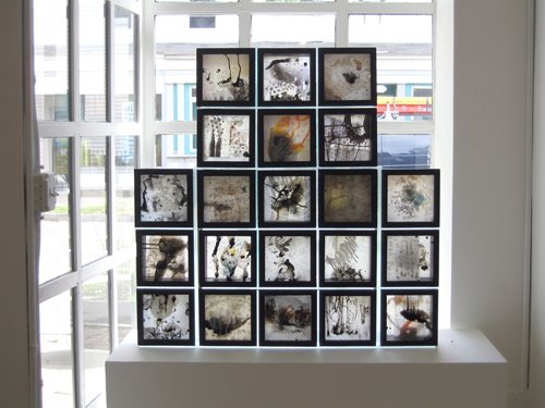
Kirsten Nelson uses architectural materials to create works that are both abstract and yet evocative of interior spaces. Each piece in this show, according to her artist statement, "evokes a recognizable site, yet it remains an invented fragment." Materials like wood moldings, sheetrock, plywood and wallpaper are part of the background noise of everyday life. In Kirsten's work, they are arranged to call attention to themselves.

In "Room Drawings," she has affixed to the wall 17 rectangular panels of varying sizes. Each is painted gray. Most are decorated in some fashion with small pieces of wood trim. Similarly, "Wall Structures" arranges cut pieces of unpainted wood molding on a wall in which Nelson has lightly drawn a grid with pencil. Nelson also has three other larger works in the show; although larger in size they are more minimal in content. All her works are austere and venture the idea of architectural space more by association than representation.

Sue O'Donnell has two different types of work in the show but both comment on the mechanisms of memory. Three pieces—"Throw," "Throw II" and "Run"—are series of blurry still images, probably video captures. They show a young girl being thrown in the air or running on a lawn. Interestingly, in the two "Throw" sets, we see a watch on the wrist of the person playfully (one hopes) tossing the girl in the air. Interesting because these are about time: chopping it up into discrete fragments, trying to store it imperfectly as memory. These aren't freeze-frame stills, however. Memories are never that exact. They are always fragmentary, hazy, and here the photographic imagery reflects that.

Her other works deal in text and graphing. The clever triptych "Relationships" is comprised of three ultrachrome prints. They purport to document states of mind like "Pressure, secrets and regret," "Fear, loss and hope" and "Faith, dreams and confusion" on a 40-year timeline. I should have brought my reading glasses for "Story Told II." Whatever the story being told in the rectangular block is, I couldn't read the excruciatingly small type. Which I suppose is the point. The story is real, but our limitations prevent us from recovering it. The charming "First Memory" is actually hundreds of interconnected memories. On a grid of black squares seven squares high by nine squares wide, O'Donnell has inscribed discrete memories within cartoon word balloons. Related memories are connected by little lines. Up close, the viewer gets involved in reading the numerous mini-narratives that flow together. Stand back and "First Memory" looks like a map of a white landmass, an island, in a sea of darkness.

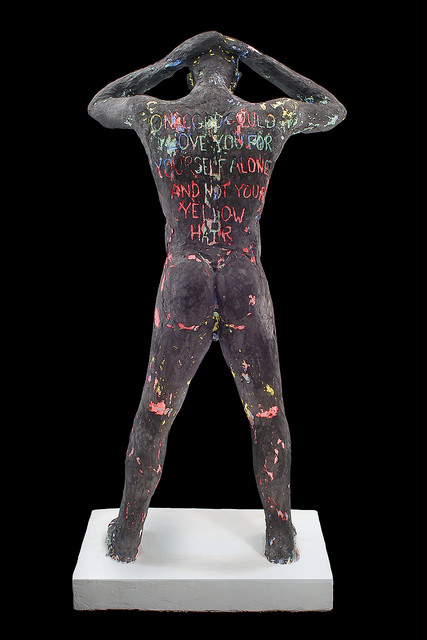
Large charcoal and paper drawings and one floor installation (and an inkjet print that reprises the installation's idea) are Christine Darnell's entries. In the drawings "Table Mort" and "Birthday," objects on a table are meant to trigger memory-like associations. "Table Mort" is set with an electric mixer, an uncut birthday cake and slices of cake on plate, an electric fan, cut pieces of fruit, shoes and a skull. It must have been quite a party. In "Birthday," we see a plate with cupcakes, a birthday cake, a bowl and spoon, pitchers and an open book. The object lines cross each other like ghostly images. Nothing is opaque; nothing has a solid presence. Here, memories are phantoms.

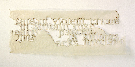
The floor installation, "And What If After So Many Words...," is a three-dimensional work in rubber and plaster. Meandering lines of cursive writing are formed out of blue rubber. Standing on top of this text are two white child-size plaster feet. It is possible to make out some phrases in the textual cacophony, but they don't cohere into a comprehensible narrative.

Memory, Mapping and Meaning is a cerebral show, but not without a sense of play, particularly in Darnell's and O'Donnell's works. But I found Nelson's pieces, with their references to remembered interior spaces, less satisfying. While I appreciate the concept behind her work, I found the actual artworks somewhat devoid of emotional presence.

Faraway in America


Creative Arts Workshop Hilles Gallery
80 Audubon St., New Haven, (203) 562-4927
A Landscape Of Things Transformed: Fethi Meghelli & K. Levni Sinanoglu
Ends Oct. 15, 2006.

The collaborative show on the first floor level of Creative Arts Workshop's Hilles Gallery is notable for the effective interplay between the primarily monochromatic works of Fethi Meghelli, an instructor in CAW's Drawing and Painting department, and K. Levni Sinanoglu's color oil paintings. In A Landscape of Things Transformed, both mine a shared emotional landscape Sinanoglu described during the opening reception as "faraway-ness."

Meghelli was born in Algeria. When he was a child, Sinanoglu traveled often to Turkey with his Turkish father. In post-9/11 America, it is not difficult to imagine that a familial connection to the Islamic world might foster a sense of otherness. Still, it can't be said that that specific issue plays anything other than a background role in this show.

Meghelli's work is certainly political. His two installation pieces are part of "The War Series," begun two years ago. But conflict is seen in broad terms in these pieces. Rather than get caught up in the crossfire of dueling ideologies or hyperventilating over a "clash of civilizations," Meghelli occupies the terrain in which the lives of innocents are shattered, scattered and splattered. This "collateral damage"—to use the Orwellian euphemism—is portrayed in "The War Series: Hanging" by suspended metal sculptures. Metal pieces cut in the shapes of human figures, animals and detached limbs are bent in contorted poses of agony. Trussed with thin wire, like a tangle of cruel circumstance, they hang from the ceiling, twisting slowly. The metal edges are jagged, for the most part, having a shrapnel-like quality. Amid the work are three non-metal objects: a gravestone-shaped tablet and two baby sneakers. All three are painted black. The sneakers are a poignant reminder of innocence lost in war (a fact our 24/7 cable news vampires deign to shield us from). And the tablet? Perhaps it is a symbol of death. But it might also be a symbol of one of the tablets of the Ten Commandments, here perverted by killers draping themselves in the vestments of warring monotheisms.

"The War Series: The Oil Drum Project" is a mixed media work that wends its way over four walls. It incorporates an oil drum, black sand and a collage of Meghelli's prints and drawings. The oil drum—which Meghelli initially acquired as part of artist Jack Lardis' Oil Drum Project series—is the centerpiece. The cut half of the oil drum is flush against one wall. Out of the top burst black paper flames, a grasping hand and a flailing figure who has lost an arm and a leg. Black sand on the floor surrounds the drum and seeps into the corner, poisoning the earth. The imagery on the walls is propelled by violence over control of the resource. Tumbling figures. Landscapes of explosions and destruction. Echoes of Picasso's Guernica. Mothers trying to shelter their children in their arms. Boats carrying refugees to safety. One such boat has ended up on a separate freestanding wall completely separate from the others, a different continent. While the central placement of the oil drum addresses the cause of the carnage, Meghelli doesn't waste imagery on the perpetrators of these crimes. His witness is reserved for the victims.

Sinanoglu's paintings offer a far different, more pacific, vision. Where Meghelli's world has been torn asunder and soiled with smoke and petro-poison, Sinanoglu's paintings chart a landscape of imagination and fancy. They are characterized by colorful architecture and a dreamy swirl of geometric shapes. There are recurring motifs of birds in flight (echoed deliberately in Meghelli's "Oil Drum" work), masks, tall tapered trees and a robot-like figure. There are three large paintings and two smaller ones; each is characterized by a distinctive color scheme.

In "Exile's Return," red and orange predominate, offset by background greens and the blue-green of the trees in the foreground. The painting next to it, "Black Dog Bardo," scans darker with its deep blues and greens and, dark to almost black birds. Darker still is "Z's Night Flight." A medium-sized painting, this is a surreal night scene. A gray shark lies beached in the foreground. Behind it is a dark blue hive-shaped building. The night sky is roiled by moonlit clouds and dark birds in flight.

Juxtaposed in this venue, the works of these two very different artists evince complementary sensibilities. It is a small show rich in visual beauty and—even where there is righteous anger—warm of heart.

Sunday, September 24, 2006

The spirit is willing (but the tech is weak)

The Episcopal Church of St. Paul and St. James
57 Olive St. (at Chapel St.), New Haven, (203) 562-2143
Joseph Higgins: Still Small Voice
Closed.

In the twilight hour leading up to Joseph Higgins' installation/performance Still Small Voice at the Episcopal Church of St. Paul and St. James, the church was dark. The fading outdoor light still filtered through the stained glass windows lining the balcony area. The audience's anticipation was heightened through the sensory combination of churchy smells—the cushions, the wood of the pews—and New Age piano arpeggios filling the nave as Higgins tested his keyboard. In the 15 minutes leading up to the performance, he set a mood by noodling at the synth, producing string tones (airy violins, guttural cellos), piano notes, pads, drones that took flight on wings of digital delay.

Introducing the piece, Higgins described it as "abstract art."

"What you bring to the work in terms of imagination and feeling and emotions, how you interact with the art is where the experience is," he said.

In front of the altar, Higgins had set up a screen for video and slide projections. To either side of the screen stood tall light sculptures. Inside the glass of the rectangular columns were twists of ultra bright yellow nylon fabric. The outside was wrapped in clear cyan proofing sheets. In the foreground on either side were black stands about three feet tall on top of which Higgins had placed long light boxes. On the glass on top of the boxes were set dozens of clear small glasses partially filled with emerald-green liquid. Truncated wedge-like panels, painted white, were set as backdrops above the light boxes. Similar set-ups, minus the three-foot stands, were situated slightly behind and to either side of the screen.

A combination of auditory and visual stimuli, Still Small Voice lasted a little over half an hour. It began in darkness with a recorded piano reverie, playing through the P.A. In this first movement, the predominant visual element was the dusky white rectangle of the screen. It was fitting to start with the audience contemplating the emptiness of the blank slate.

In the second movement, light started to glow in the two front light boxes. Refracted through the liquid, the light cast soft green-tinted shadows and shapes on the panels. In short order, the two light boxes to the rear were activated, subtly raising the illumination. The column to the right of the screen was gradually lit, and then that to the left.

A video performance, "She Draws the Light," dominated the fourth movement. The footage was shot through clear plastic sheeting that swayed and flickered with bursts of reflected light. A robed figure moved around a set, using a pitcher to pour green liquid into the small glasses. The scenario had the feel of an obscure religious ritual.

Manipulated slides were the focus of the fifth movement, "Transition." Many of the images were shot at trainyards or industrial locations (in Providence, Rhode Island, Higgins told me after the performance). The scenes, devoid of a physical human presence, were ruptured by fiery orbs and ovals of light. My reaction was that the imagery was akin to the effect of film burning up while a movie is being shown. And, in fact, the slides were burned with a lighter. There was the suggestion of transition, of the expunging of the existing world to clear the way for something new to be born.

That new world flowered in front of us with "Ascendance," the final movement. Details from Higgins' paintings were projected. Painted on ceramic tiles in a process of Higgins' own creation, they were characterized by swirling abstract imagery. Each image remained onscreen for an extended period of time, long enough for the viewer to be almost forced to invest imaginative energy in contemplating them. I saw strange animal-like figures, flesh and bone, clouds of darkness being dispersed by explosions of red, yellow and white light. The universe-creating Big Bang came to mind.

And then it was over. (Or had it just begun?)

Still Small Voice was an ambitious undertaking. Higgins' score was effective in setting a mood without being disruptive or intrusive. The physical set-up was creative, although it might have benefited had it been less symmetrical. The imagery and video were evocative.

It wasn't, however, an unqualified success. There were two sets of problems, the first technical and the second aesthetic.

On the technical front, it became obvious, when Higgins was playing prior to the performance's start, that the P.A. could not handle a reasonable volume from the keyboard. It would crackle and clip at the peaks. This necessitated turning down the volume to a level that allowed sounds from the street to intrude on the performance. More distracting were computer glitches that occurred at the beginning of "Transition." It was not a smooth transition when an onscreen cursor and then the Windows desktop interrupted the flow of the imagery. Fortunately, the computer issues were straightened out and didn't recur.

From an aesthetic standpoint, I felt that the disparate elements never cohered into a unified experience. The music and projections dovetailed nicely. But once the projections began, the other element of the installation—the light sculptures—seemed orphaned, un-integrated into the overall gestalt. And the conclusion was unsatisfying. The audience only knew it was over because Higgins got up from his keyboard.

Yet, even if Higgins' ambition somewhat exceeded his grasp, Still Small Voice was a rewarding event. As Higgins said to intro it, abstract art asks the viewer to invest creative effort of their own. And in this mixed media installation, there was plenty of material worthy of that effort.

Thursday, September 21, 2006

Creative Arts Workshop opening reception this Friday

Creative Arts Workshop Hilles Gallery
80 Audubon St., New Haven, (203) 562-4927
CAW Faculty/Guest Artist Exhibition featuring Christine Darnell, Kirsten Nelson & Sue O'Donnell; Fethi Meghelli & K. Levni Sinanoglu
Opening reception Fri., Sept 22, 5—7 p.m.

The opening reception for two separate faculty/guest artist shows will be held tomorrow evening from 5—7 p.m. at Creative Arts Workshop in New Haven's Audubon Arts District. Fethi Meghelli and K. Levni Sinanoglu offer their visions under the theme A Landscape of Things Transformed. The trio of Christine Darnell, Kirsten Nelson and Sue O'Donnell present the alliterative Memory, Mapping and Meaning.

Both shows close Oct. 13.

Wednesday, September 20, 2006

Still Small Voice this Friday

The Episcopal Church of St. Paul and St. James
57 Olive St. (at Chapel St.), New Haven, (203) 562-2143
Joseph Higgins: Still Small Voice
Friday, Sept. 22, 2006, 7:30 p.m.

Joseph Higgins has wanted do a show involving projections and a live musical score for a long time. He plans to realize that ambition this Friday at the Episcopal Church of St. Paul and St. James in New Haven.

Higgins says he got the idea to use the church for an installation piece a little over a year ago. "I attended a performance by [oboist] Libby van Cleve at St. Paul and St. James. I walked away from the performance saying 'I have to do a show at this church,'" he recalls in a phone interview with Connecticut Art Scene.

Higgins did a treatment of the show, Still Small Voice, for a committee of the church and won their approval. Viewers often tell him that they see something "spiritual" in his work, Higgins says. It is a response he finds gratifying.

The installation combines light sculptures, video and still image projections along with a live score by Higgins. While he usually plays "abstract jazz," Higgins describes the score for Still Small Voice as "ethereal. It has overtones or hints of classical music in the straight piano parts. One section is quite jarring because of the nature of the video that it is sequenced with." Higgins will be assisted by chief technical engineer Maria Satterwhite, chief musical engineer Peter Edwards and video operator Jo Ann Moran.

I ask if Still Small Voice might be analogous to the "Happenings" during the 1960's.

"'Happenings' were interesting. They were probably a little more spontaneous," he says. This event has been in the works for "a little over a year. The show itself will last about 45 minutes. But it will be a happening, alright!"

The doors open at 6:30 p.m. The performance starts at 7:30 p.m and there will be no admittance after 7:30 p.m. Admission is $10, and $5 for seniors and students.

Monday, September 18, 2006

It's Elementum, my dear Watson

City Gallery
994 State St., New Haven, (203) 782-2489
Elementum
Ends Oct. 8, 2006.

Curated by Liz Pagano, Elementum is a small show with some large artworks. It is organized thematically around interpretations of the four basic "elements": earth, air, fire and water.

Leila Daw's "doesn't stand a chance" is an over-sized mixed media work on four abutting tall vertical canvas panels. It depicts a dark mountainous landscape as it might be seen from an airplane. Adhered to this landscape are layers of painted fabric, printed imagery, whorls and streaks of glitter, and fragments of text. According to Daw's notes for the show, "The piece maps and reflects upon the way water shapes the earth, lies on the earth, evaporates into the air and sinks into the earth." In shades of blue and purple, rivers and tributaries traverse the landscape. There are disturbances in the sky. Objects—hailstones, meteorites?—rain down upon the land. The text reinforces the sense of massive forces at work. In fragments it reads, "like a river in the desert doesn't stand a chance now you see it now you don't."

With its landscape of rocky outcroppings, Susan Newbold's "Life Journey" registers on the eye as something of a cousin to Daw's work. Newbold has affixed a long stretch of frosted mylar over an enlarged digital print of mountainous stone. The mylar diffuses the background print. With ink, graphite, charcoal and watercolor, she has drawn on the mylar over the landscape, adding hints of earth-toned browns along with the blacks. Using both pen lines and ink washes, the two layers combine to convey a sense of restless energy and upheaval in a landscape that might otherwise appear inert. Newbold's piece also invites closer inspection for the pleasure of her line and brushwork, the way the shadings and colors blend together.

Gloom and foreboding marked my reaction to Dorothy Powers' striking "Night Forms, New Haven." In these works of charcoal and acrylic on paper, shapes of massive black oil tanks dominate the compositions. They are surrounded by dark skies. Hints of light are more evocative of threatening fire than comforting illumination. Powers' commentary on her works says that, "They represent both the positive and negative elements that the Earth has to offer." True, the oil tanks suggest the natural wealth contained within the Earths. But visually, these paintings primarily emphasize the negative. This is an environment of smoke and eternal night, the paint and charcoal clinging to the paper like soot to brick or coal dust to a miner's skin.

In contrast to the dark, heavy nature of "Night Forms, New Haven," Suzan Shutan's "Simbolo Lingua Natural" is heavy in concept but light in execution. Contained within a large horizontal ellipse are the symbols for air and water (drawn from the periodic table of the elements) and earth and fire (from ancient alchemical symbolism). The installation uses black string stretched around an array of T-pins stuck into the white wall. Fastened to the ends of the pins, the string image is about one inch from the wall. Intersecting lighting casts multiple shadows of varying strength. In her notes on the piece, Shutan states, "The installation subscribes to the idea that everything consists of each other." Shutan fortifies this ecological concept by employing symbolism drawn from the scientific and spiritual realms. While quite large, the work is light. It contains both its solid material components—the pins and string—and their shadows: substance and spirit. And each physical referent has multiple shadow responses.

Pagano has included three different series of works of her own, although there is a continuity of approach over different media. I lived on a lake when I was a child and I remember I loved looking at the formations the ice made in the stream that fed the lake. Pagano's "thin ice I" and "thin ice II" (suminigashi with embossed overlay) indicate she shares that fascination with the way water swirls, traps bubbles and straddles the boundary between liquid and solid. We see the underlying prints through the diffuse overlays—fluid, concentric eddies of blue, gray and black. The swirl of water in "thin ice I" resembles another natural form: tree rings. The overlay is embossed with raised rings that look like bubbles of air caught in ice.

Her series of India ink on six sheets of paper, "amalgam/the mix," are abstractions that take pleasure in the way water interacts with black and yellow ink. Rather then lay on the surface of the paper, the mix of ink and water soaks into the fibers. Possibly depending on Pagano's method of application, this merging of solid and liquid create different but very natural textures and forms. There are coronas of translucent tone, hazy clouds, fingers of ink that look like veins or rivulets of rain on a windshield (at 60 miles per hour), spatters of ink. Throughout the six, the varying completeness of absorption suggests processes captured at different rates of velocity.

Sitting in the gallery window—benefiting from the natural light—is Pagano's third work, "U-UIII." This is a mixed media construction of 21 black-framed boxes with two facing sides of glass. Some also contain plexiglass, cheesecloth and pieces of paper. Abstract forms in oil paint or ink overlay and interact with each other. There are splashes of ink, splotches, milky adhesions of white or color, nebulae of light and shadow and tendrils of line.

Almost all the works emphasize the interconnectedness of the elements, and, by extension, of the world for which they are the building blocks. But I also discern (probably unintended) connections between the works themselves: Daw's and Newbold's mountain terrain, the washes of ink in Pagano's and Newbold's art. This is a show that rewards both thought and vision.

Friday, September 15, 2006

Text messaging


ALL Arts & Literature Laboratory
Erector Square, 319 Peck St. Building 2, New Haven, (203) 671-5175
Texture
Ends Sept.16, 2006.

Incorporating text, letters and words into art isn't new but it has, over the past decade or so, become something of a postmodernist obsession. The exploration of meaning—or the concrete lack thereof—in language is fertile soil for intellectual play. And while literary theorists can spin out endless word-processed academese on the hermeneutics of the sliding of the signifier, artists can work the same ground with a broader palette and, probably, more fun.

"Fun" is not necessarily the first word that comes to mind with many of the works in the ALL Gallery's juried Texture show. But some coax a smile to go along with the intellectually furrowed brow. Caitlin Reuter's two life-size male and female figures, "Predator" and "Nymphet" (plaster, pigment, fake fur and enamel) comment on the way the construction of identity is inscribed in the body. In these cases, literally so. The man is bent slightly forward at the waist, his hands behind his head. His figure is under-painted blue, pink, green and yellow over which she has applied a coat of flat black. Carved into his back is the denunciation "Only God could love you for yourself alone and not your yellow hair." Incongruous fake black fur tufts form his armpit and pubic hair. The female figure, posed insouciantly with hands on hips, is over-painted with a mottled pink salmon color. Her shaved head is topped with a neon pink Mohawk of fake fur. "There are whip marks on his back but he loves me" is inscribed on her back. There is a serious point here about how words define who we are (or how we see others). How much can we imagine about these figures' "lives" through a single sentence? But that point is lightened with visual cues like the fake fur.

Julie Fraenkel's "(Self) Portrait," a charcoal and mixed media work, comments on the way individuals can use words-I believe the clinical term is "negative self-talk"-to undermine themselves. The central image is a drawing of a woman with short, dark hair. The drawing is worked over. And over and over. Her eyes fix the viewer. But her real gaze is relentlessly internal, reflected in layers of over-written text. The text reads as an internal monologue of a psyche in distress, overwhelming itself with criticism, self-doubt and second-guessing: "Make her head smaller. Change the shape here. This side is not as good. I need to remember to mention to ignore all the proportions." The fog of critical thought surrounds the woman. It transgresses all her physical boundaries and seemingly immobilizes her like a deer caught in headlights. A paralyzing solipsism. (Solipsitis?) But right in the center of the figure's chest, in darkest charcoal, is the redemptive statement: "She is not me anymore." It is either a work of courageous self-revelation or empathetic observation and imagination. The interior world made exterior in the form of the profusion of text distracts the viewer as it distracts the individual experiencing it.

There is a world's worth, and words worth, of anguish in Hollis Hammond's' "Hospital Stay." A large drawing, not quite life-size, it depicts a bald man reclining in a hospital bed with his knees slightly elevated. He is surrounded by the mechanical appurtenances of life in the hospital ICU: high-tech machines, tubes, IV's. Filling up the empty spaces of the image are words. Possibly the transcriptions of emails about "Pop's" condition, the text immerses us in a two-month diary of coping. The figure of Pop is central, the image around which the swarm of words marks the ebb and flow of his treatment, his snowballing complications and the mounting frustration of the writer.

The working of memory is the subject of Donna Ruff's "Britain Rose." Ruff used a wood-burning tool to burn fragments of newspaper text into off-white handmade paper. According to Ruff, with whom I spoke at the show's reception on Sept. 9, the work is part of a series she did on various newspaper items that caught her attention. In this case, the excerpt is from a New York Times—recognizable by the distinctive font—story on crime and race in Britain. Ruff says she "wanted to give a few hints of what the story was about" without spelling it out. The edges of the letters are singed. The delicate nature of the paper causes the letters to curl in different ways, casting elongated fringed shadows. Bringing to mind the phrase "burnt into memory," it is a creative statement on how the mind processes information and, perhaps, the fragile and contingent nature of that process.

Two works explore the relationship of word to image (and both to "reality") from different angles. Ben Pranger's "Well-House" reads two ways. The paper is embossed with Braille text. The empty space where there are no Braille letters forms the suggestive outline of a house. Blind or vision-impaired visitors are encouraged to touch the work. In doing so, they can read the text, which quotes from Helen Keller's autobiography. According to information on the gallery's Web site, "In these 180 words, a blind reader receives more suggestive information than the viewer of the image."

Rachel Hetzel's two intaglio prints, "Jump" and "Fall," raise the question of which representation-word or image-best communicates a concept. Centered the near the bottom of each, in open space surrounded by black, are the title words. Above the word in each print is the silhouette of a figure engaged in that action. In the blank space defined by the outlines of the figures is text related to the word. Both word and image are ultimately abstract and neither are truly a "jump" or a "fall." How they ultimately relate to each other and to the real act is an arbitrary construction of language. Still, the dynamic figures could be more easily "read" across barriers of language.

If one picture is worth a thousand words, then how many words are pictures with words in them worth? Judging from the works on display at the ALL Gallery, a lot. (Although all this columnist can afford to spend are words of praise.)

Wednesday, September 13, 2006

Endless summer. Not.

New Haven Free Public Library Art Gallery
133 Elm St., New Haven
Joan Jacobson-Zamore: End of Summer Series
Ends Oct. 14, 2007.

Who wants summer to end? Not me. But end it will, and soon. For those of us dreading the approaching chill, Joan Jacobson-Zamore’s End of Summer Series show of monotypes at the New Haven Free Public Library offers a clutch of color to help ease us into fall. Curated by Johnes Ruta, the exhibit features 15 large prints distinguished by brash brush work and bold color choices.

"In the Garden—Summer Light" is a riot of color. A V-shaped trellis is in the background. A thick-trunked, multi-branched tree occupies the foreground, its ridged bark delineated with squiggles of burgundy, blue, white, brown and green. Zamore takes a gestural approach. Summer’s grace is fleeting. The moment—the visual moment—must be seized with all the immediacy at the artist’s command.

In "Irises in Joan’s Garden," the long tapered leaves reach up from the left bottom corner into the center of the composition. Out of them shoot seven of the bulbous purple flowers. The application of color is charged with energy. It is as if the luscious plant growth is exploding from the nurturing earth.

"Cindy’s Window" is a well-realized interior scene. The centerpiece is a display of five yellow flowers, their undulating green stems tapering into a glass vase. The room around swims in pastel aquamarine and is bathed in warm light through the window in the background.

Several prints portray a single stand of trees. By varying the color and shading, Zamore varies the emotional mood of each. "Blue Monday I" has an overcast feel. "Frightened Trees" is the darker, literally and figuratively. In "Steppin Out for Apple Pickin," the background color is a washed-out orange, the hint of autumn soon to come. "Acid Trees in Downy Glen" has a warm aspect with its pastel pink, orange, powder blue and purple. Because all the trees are bare of foliage, I see an aura of melancholy running throughout this series, notwithstanding the lively coloration.

In capturing her vision of the natural world, Zamore strives to find the essence in the shapes of things: their relationships, their life force. With her unfettered application of color and unwillingness to be constrained by too-literal representation, she rushes that essence to paper with energy intact.

The opening reception for End of Summer Series will be held at the library on Saturday, Sept. 16, 2:30-4:30 p.m.

Sunday, September 10, 2006

The eye has a thousand nights

Yale University Art Gallery
Chapel at High Street, New Haven, (203) 432-0600
To Know the Dark: American Artists’ Visions of Night
Ends Jan. 14, 2007.
The night
Makes everything grotesque. Is it because
Night is the nature of man’s interior world?
Wallace Stevens; "A Word With Jose Rodriguez-Feo"

Comprising about two dozen works by American artists of the 19th and 20th centuries, To Know The Dark at the Yale University Art Gallery plumbs night as a metaphor for aloneness. In a small room off the main American art gallery, the dark walls are decorated not only with visual artworks but also with numerous literary—primarily poetic, such as the Wallace Stevens excerpt above—quotations pertaining to night and the dark.

This solitude is represented in Edward Hopper’s "Every Wind," a 1921 etching. A naked woman, her face turned away from us, climbs into bed. She looks out the open window as curtains billow into the room on a breath of wind. Similarly, in Hopper’s 1921 etching "Night Shadows," the viewer looks down on a solitary figure on the city sidewalk. Neither subject has the luxury of having their isolation pierced by returning the viewer’s gaze.

Even where there is the presence of multiple individuals, the sense of alienation remains. In Jacob Lawrence’s ink on paper work "Hot Summer Night," a fire escape is a place of haunted rest for a clearly uncomfortable tangle of family. Winslow Homer’s oil painting "In Front of Yorktown" depicts Union Civil War soldiers in a wooded encampment. Their faces grim, we see them alone in their thoughts, perhaps contemplating the nearness of death. The fall of darkness and the imminence of mortality have long been symbolically inseparable.

Notwithstanding the "dark" connotations of night, most of these works can be considered beautiful. George Benjamin Luks' "Evening Splendor," a watercolor circa 1930, layers a sunset of sultry gold, scarlet, translucent purple and blue over a black horizon. Georgia O'Keeffe's "Evening Star," also a watercolor, embraces abstraction while wetting the Japanese paper with the same lively colors painted by Luks. In his uber-Impressionist pastel "The Evening Star," Childe Hassam uses thousands of strokes of soft blues and off-whites to render a bright night sky.

In visualizing the darkness, the quality of light is precious, be it the reflective glow of the moon, the blaze of fire or the artificial glare of electric light. In George Inness' "Moonrise" (1887), a solitary figure stands in a boat in a marsh as the moon peeks over the horizon. The promise of home is seen to the right off in the distance. There is an eerie greenish cast to Ralph Albert Blakelock's "Moonlight," an oil on canvas circa 1880. Silhouetted tree branches somewhat obscure the glowing lunar orb. Still, amid the starless darkness it casts its reflection on the water below.

The presence or absence of city lights are notable in two photographs of New York City in the 1930's, one by Berenice Abbott and one by Edward Steichen and both titled "New York at Night." Steichen, situated within the brick and concrete canyons and looking up, sees row after row of dark lightless windows. Only the streetlights below resist the darkness. In Abbott's photo, viewing Manhattan from high above, the metropolis blazes with electric illumination.

Abbott's gelatin silver print is the only work in the show that hints at another, very different, conception of night: sociability and play. For night is also a time of music, the part of the day most associated with liberation from work, the refuge of sex. The Carl Sandburg quote on the wall recognizes this: "In the night the city lives too-the day is not all" (from "Night Movement-New York").

Or, to quote the Pretty Things from their 1965 record "Midnight to Six Man":

I sleep through the day, I wake around 4
But I always feel down, never get off the floor
Til the night comes around
See you downtown
Yeah, take in some sounds
Baby we'll score
Tell me some more
Midnight to six!

Thursday, September 07, 2006

Let's play tag


Artspace
50 Orange St, New Haven, (203) 772-2709
The New English
Site-specific graffiti works by Demo, Dooley O, Mister Never and Nick Z
Ends Sept. 16.

If you had a big window and a big facing wall, what would you do? Cover the wall with graffiti? If you are Denise Markonish, Artspace Gallery Director, that seemed like a great idea for a summer show.

"I wanted a conversation between outside and inside and graffiti seemed a great way to do that," says Markonish. For the show The New English, Markonish invited four graffiti artists—two now based in New York who she had met when she and they lived in Boston and two from New Haven—to paint (or "tag" in hip-hop parlance) individual works on Artspace walls and also collaborate on tagging the Project Room. "I told them to 'come in and do what you do as if you have a freighter here.'"

New York-based artists Nick Z and Mister Never both have large gallery experience. New Havenites Demo and Dooley O were new to plying their art in an established gallery. By the evidence on the walls, they weren't intimidated by tagging in a highfalutin licit venue. If anything, their large works steal the show.

Dooley O's paintings ("Old School" and "Brat") are bold statements of color and stylized text in the classic graffiti tradition. In one, a male figure in the bottom left corner extends his left hand and the word "SOUL" nestles in his Afro. Demo's painting ("Interruption") is a sci-fi landscape as one might see rendered on a highway overpass. (And maybe you have!) Jagged overlapping shapes outlined in pink and filled with a greenish-yellow drift past blue and green stalactites and stalagmites. Their definitive contours are offset by fluid, soft-focus bursts of magenta.

Mister Never's untitled work uses a more restrained palette (if cans of spray paint can be considered a "palette"). He wields spritzes of black, pink and light blue paint. Curving around two walls and into the Project Room, it features a motif of text ("Kid you love to hate," "Say it to my face," "$hine" and more), hearts, dollar signs and arrows. Some of the underlying painting has been effaced with white paint.

Nick Z was the only one of the four artists to choose to work with latex paint rather than spray paint. Perhaps for that reason, his "So So Punk," while pleasant, doesn’t have the gestural energy and excitement of the other works. Floating letters spell out "So Punk" as if exhaled from a bubble machine. Figures that seem like the mutant offspring of horses and old-fashioned high button shoes spew purple curlicues of arrow-tipped smoke.

All four artists tagged the walls of the Project Room. But, according to Markonish, the idea to decorate liquor bottles and display them in the room was primarily Dooley O’s. The 40-ounce malt liquor bottles (and a few bottles of vodka, wine, gin) either have had paint poured over them or been tagged with statements like "Old School" and "Die Slow."

"The initial idea was to have a fun bodega-like twist," says Markonish. "They used the bottles as a reference to the street."

Graffiti, of course, is an outgrowth of hip-hop street culture. In the early 1980’s, a number of graffiti artists, particularly in New York, were embrace by galleries. From dodge-the-transit-police hit-and-run painting of subway trains, artists made the transition to working on canvas for collectors. But after the art crowd fashion frenzy subsided, Markonish says, graffiti "went back to the streets and back underground."

"I think all these guys started doing this on the streets, and still do to some extent," she says.

Graffiti is having its day again in the galleries. Markonish notes that the Brooklyn Museum is presently hosting the show Graffiti Basics.

"I’m always interested in works that are more immediate. In working with spray paint you’re not laboring over something obsessively. A lot of these bigger works were done in one night," Markonish says.

"It was great fun to have them here and see these walls transformed," she says. "It will be less fun to paint over it."

Wednesday, September 06, 2006

The look is you

Artspace
50 Orange St, New Haven, (203) 772-2709
Jean Shin: Ensemble: A Collaboration with New Haven Public High School students
(Participating students: Mohamed Badawi, James Barros, Gabriela de Jesus, Wesley Frasier, Kimberly Jowers, Oyin Kolawole, Nicholas Pfaff, Alika Potts, Sarah Rivera, Stephanie Rivera, Arzoo Rohbar, Olivia St. John, Alejandro Velazquez)

As part of Artspace’s sixth annual Summer Apprenticeship Program, 13 New Haven high school students under the tutelage of artist Jean Shin constituted an ensemble that created Ensemble. Taking clothing as a signifier of personal identity, Shin and her student collaborators deconstructed the signifiers and then reconstituted them into a collective artwork. Or, to put it another way, each student brought in an outfit that represented themselves; those items of clothing were cut or torn apart and then used to make artwork. Ensemble utilizes the two facing walls in the main space of the gallery.

Each wall was painted a warm pastel yellow, providing a neutral background canvas. Against the outside wall, the cut pieces of fabric—solid, patterned, a few with text or logos or iconic imagery (Che Guevara, Superman’s "S" symbol—are starched flat against the surface. From left to right, the design reads almost as a color gradient of red through yellow, pink and white to grays that then progress into blues and greens. Some are identifiable as a specific item of clothing—a striped shirt, a blue jeans pant leg with pocket. Attention was paid to varying the sizes, shapes and angle of positioning of the fabric pieces, which keeps the eyes moving over the piece.

Engaging as that part of Ensemble is, the section suspended from hooks at the top of the inner wall is a true delight. Here the shirts, blouses, pants, pajamas and boxers are cut and torn into strips. The disparate articles of clothing are held together with straight pins, forming an anarchic hanging web.

The fabric pieces adhered to the outside wall form a collective work while remaining each in its own place. There is no touching or overlap. The hanging gardens of cotton and polyester, on the other hand, emphasize individuality within an overarching interconnectedness. Or, to paraphrase Ben Franklin, we must indeed all hang together, or, most assuredly, we shall all be flattened against the wall separately.

Ensemble is on view through Sept. 16.

Dancing dots in the woodpile

Artspace
50 Orange St., New Haven, (203) 772-2709
Gerald Saladyga: "9th Square Light"

Situated in the Artspace Lounge just to the left of the entrance, Gerald Saladyga’s “9th Square Light” (acrylic, wood and paper) is an extension of his signature style into the sculptural/installation medium.

There are two distinct parts to the work. The inner wall bounding the work is painted black and covered with a grid of 11''x14'' sketchbook pages tacked on with pushpins. Each page is painted over in acrylic, the engaging background color fields peppered with a profusion of paint dots (as if the night sky was filled up with miniature colored planets rather than twinkling stars). Some of these small paintings are riven by little rivers where an absence of dots creates a suggestive open space. Typical of Saladyga’s art, there is a delight in color—purple dots on deep blue, pink on orange-ish-yellow, light green on burnished black and tan.

Extending this portion of the work into the third dimension are a dozen long painted two-by-fours. Planted on the floor about a foot from the base of the wall, they lean against the top of the wall. They share with the paintings on paper Saladyga’s affinity for coarse brush work around the edges. But unlike the paintings, they are adorned with solid colors and no dots, a different color for each plane of the board.

The boards act almost as conductors, transferring the energy of the paintings through the floor and into two or three dozen more boards stacked in the middle of the floor. These are painted first with the color fields and then with the dancing dots. There are several sets of boards painted in similar patterns. This has the effect of giving the eye cues with which to knit the helter skelter of the pile together into a visual coherence.

Saladyga’s works have a tendency to enliven any space in which they are situated and that is certainly the case here. “9th Square Light” is on view through Sept. 16.

Monday, September 04, 2006

Why are we here?

New Haven and the surrounding environs are rich with talented visual artists. Rife with shows that are intellectually provocative and/or treats for the eyes. But our community has been lacking in reporting on the visual arts. The purpose of Connecticut Art Scene is to remedy that failing, to give our visual arts community the attention it deserves.

Within constraints of time (and gas money!), I hope to not only review shows but also interview artists, preview important events and, in general, provide a regular forum for news and feedback about our valuable Connecticut Art Scene.