Dedicated to covering the visual arts community in Connecticut.

Monday, November 27, 2006

Body of work

No Regrets Tattoo Studio
195 Rubber Ave., Naugatuck, (203) 729-3115
No Regrets Art Show
Closes Dec. 20, 2006

It's safe to say that No Regrets, Ink., a tattoo and piercing parlor in Naugatuck, is not your standard white cube gallery space. Heavy metal and punk rock music blasts out angry rhythms. The walls themselves are spray-painted to look like a stone castle, or dungeon. Fake metal gargoyles are perched on the parapets on the upstairs landing, overlooking the main room.

But No Regrets, open about three years, is hosting their first art show. The opening was on Nov. 17 and the show will up until Dec. 20. Many, if not most, of the participating artists are tattoo artists affiliated with studios around the state.

Where does this work fit in the conventional scheme of the art world? On the outside looking in, albeit with substantial indifference if not outright disdain. One major factor separating these works from what you might see in a gallery in New Haven is subject matter. Because as far as technique goes, some of these artists (not all—there is some dross here) are damn good at what they do.

Take artist Tim Harris, for instance. Harris' "Ladia del Muerto" features a skeletal hand clutching a pair of maracas, a couple of stylized skulls and a buxom beauty with puckered purple lips and face makeup that models a skull. Sweet! His "Miss American Pie" boasts a classic 1950's pickup truck kicking up dust, a cocked whiskey bottle and the proverbial farmer's daughter offering up a sloppy piece of pie and an eyeful of cleavage. Pulp fiction, for sure. But rendered in color pencil with such grace and facility as to achieve a certain kitsch transcendence. Similarly, his "Krylon Dreams" is a brilliantly executed color pencil drawing of a can of spray paint.

Similarly, Joe Capobianco—like Harris, a tattooist at Hope Gallery Tattoo—shows two over-the-top airbrush works, "Butchered Blue" and "Island Fever." They are pin-up girls of the 1940's refracted through the sensibility of contemporary tattoo culture. They are not a critique of pin-up art nor an ironic commentary. They are a celebration.

"Whatever's not popular in the modern art world, we tend to go in that direction. What separates us is it's deviant and we know that. It's deviant art," says Phil Young, a tattoo artist at No Regrets and one of the participants in the show. "The thing about a tattoo artist that's different is that we have to do anything. If someone wants a pig flying over New York City, we've got to draw that. We have to cater to any subject and put it in a style they like."

These days, with tattoo and body art having gone relatively mainstream, Young says there are more artists wanting to be tattooists.

"There's not really that many ways for artists to make a living today," says Young. And in contrast to the old days—like, say, the early 1970's—the tattoo scene is today "almost like a popular subculture, if that makes sense," says Young. It does.

Young's own "Baby Teeth," is a macabre oil painting of a young woman vampire. Her lips are smeared with burgundy blood after biting into a Barbie doll she holds in her hands. It's bizarre. "Baby Teeth" could be a 1930's pulp magazine cover, with its dramatic red backlighting. It might look out of place in the Yale University Art Gallery. But is it really more bizarre than revered religious art of the Middle Ages or Renaissance? Than surrealism?

Christian Perez's "Blood Bath" is a cartoonish political commentary. A porcine figure in a gas mask lounges in a sea of scarlet blood, pouring a beaker of blood over his bloated belly. Subtle? Not so much. He wears American flag briefs. The tip of a missile protrudes from the sanguineous sea. It is a color pencil drawing on board mounted within a black box frame. Bullets, pointing inward are affixed to the frame edges. Perez works at Lovecraft Tattoo in New Haven.

Chris Uminga's "Ben Sasnoff," is an ink and watercolor drawing of a waif, like the large-eyed children of motel room infamy as imagined by a cross between the Cartoon Network and Chiller Theatre. Uminga, a comics artist with his own creepy, fluid style, has painted his creation with pointed horns and elf ears and a big open white face with dark circles framing blank yellow eyes.

Whatever his intention, Marc McChesney's "Crucifixion" is deeply affecting in its representation of the agony of Christ. The figure is contorted on the cross, mouth wide open in screaming pain. McChesney's energetic brush work and coloration are filled with wonderful collisions of freeform abstraction. He has a true affection for color. Another painting on panel, "Harem (Figures)," works in a rainbow of colors in the background. On top of that, he has used black and white paint to sketch gestural female nudes.

Among the standout works are Ericka DeVoid's dolls, displayed in a glass case. According to Phil Young, DeVoid was inspired to try making dolls by seeing dollmaking on a Martha Stewart TV show. But DeVoid's dolls are not cute, homey Martha Stewart Living objects. They are more akin to the characters that populated filmmaker Tim Burton's The Nightmare Before Christmas. "Rita Mortis," a goth doll with attitude, has the phrase "Bite Me' spelled out on her fingers. Her full-length leather dress has two front seams held together with safety pins. A bent nail pierces her nostrils and obvious baseball-like stitching arches over her forehead.

Also in the display case are samples of two very different types of artwork by No Regrets owner Rob Gramlich. There are a couple of surreal Photoshopped digital collages, which are nicely done. Even more impressive are the two clay sculptures, in particular "Three-Eyed Snail." Gramlich sculpted the snail and its base out of clay, painted the entire work and then coated it with a shiny glaze. Sure, there's a strong element of subcultural kitsch to it but it's also lively, well crafted and convincing.

This is the realm of skulls and snakes and blood, faces twisted in anguish or shrunken in alienation. Perhaps it's not the "Garden of Earthly Delights", but it's certainly an imaginative world in which Hieronymus Bosch could feel at home.

Events this week

Artspace
50 Orange St, New Haven, (203) 772-2709
Don't Know Much About History
Nov. 18-Jan. 20, 2006

Gallery talk, Thurs., Nov. 30, 6 p.m.

An overview of 20th Century Arab modern art by Lebanese Curator and Gallerist Saleh Barakat, founder of Agial Gallery.

Barakat is a 2006 Yale World Fellow. He lives and works in Beirut, Lebanon.

This talk is presented in conjunction with Don't Know Much About History: An exhibition exploring the recontextualization of history by contemporary artists. Curated by Denise Markonish. Featuring: Deborah Bright, Charles Browning, Johnny Carrera, Colleen Coleman, Mary Dwyer, James Esber, Lalla A. Essaydi, Titus Kaphar, Michael Krueger, Justin Richel, Andrea Robbins and Max Becher, Allison Smith, Jonathan Santos, Phil Whitman, and Joe Zane.

•••

The New Haven Library Art Gallery
133 Elm St. (lower level), New Haven
Valeriu Boborelu: Luminescence and Depth
Nov. 18-Dec. 30, 2006

Artist's reception: Sat., Dec. 2, 2:30-4:30 p.m.

Artist Valeriu Boborelu hails originally from Bucharest, Romania. He obtained his MFA in 1965 at the Nicolae Grigorescu Academy of Fine Arts there, as a student of the world-famous painter Gheorghe Saru. He went on to teach Composition and Drawing there from 1966 to 1982, and became the Chair of Painting. After studying Painting, Drawing, and Art Documentation in Perugia, Rome, Bologna, Venice, Naples, Sicily, East Germany, Czechoslovakia, and Russia, he was allowed to make study visits to Paris, from where in 1983 he was able to bring his family out of Ceausescu's Romania, finally settling in Kew Gardens, Queens, New York.

Boborelu is an inspired painter of human shapes in ancestral & anthropomorphic silhouettes—silhouettes integrated in verticals, obliques, and spirals superimposed to create a continuous movement of space. Using contrasts in a reduced range of colors, polarities of white & black, large strokes of modulated grays, gestural tensions create a Chromatic Vertigo, a vibration, and depth:

In my paintings are human shapes and forms inspired by the mineral and floral worlds. Figures are luminous, transparent and pearl-white colored, and appear from the Blue-Black depths of space. Underlying geometric drawing combines with the harmony of sober color. There is a dialogue between Part and Totality. In my vision, these figures symbolize our subtle inner-nature of Wisdom and Compassion-our spiritual Bodies of Light.
For more information, please contact:
Curator: Johnes Ruta
(203) 387-4933
azothgallery@comcast.net
http://azothgallery.com/gallery.htm

•••

City Gallery
994 State St., New Haven, (203) 782-2489
Give Art

Opening, Sun., Dec. 3, 12—4 p.m.

Great art for gifts, and everything for $100.

Thursday, November 23, 2006

Art show at No Regrets Tattoo

No Regrets Tattoo Studio
195 Rubber Ave., Naugatuck, (203) 729-3115
No Regrets Art Show
Closes Dec. 20, 2006

Press release

No Regrets Tattoo Studio in Naugatuck is hosting its first art show. An eclectic event, the show features about 30 artists from Connecticut, Massachusetts, New Mexico and California including tattooists, children's book illustrators, photographers, doll makers and more. The show opened on Nov. 17 and will run until Dec. 20.

The show will be viewable during shop hours, which are Mon. Tues., Thurs., Fri., Sat., 11:30 a.m.-7 p.m.

Artist list:

Nick BaxterMarc McChesneyErica FabrizioJamison OdoneCarrie FijalLaura UsowskiSarah ChurchillErin DeludeDaniel UrbanoSam StilesKevin StilesChris UmingaMatt ThomasAshley ThomasChad LockhartSteven "Angel" McCulleyRobb BajorosJessica BajorosPhil YoungBob MurdockEric MerrillCorryn YoungTim HarrisJoe CapobiancoJulio RodriguezJesse TomlinClare JordanAlana LawtonJay CrockettJoey D"tattoo" AndyJasmine WoodburySilas FinchRob GramlichAngel CruzEricka DeVoidDavid Nielsen

History examination

Artspace Untitled (Space) Gallery
50 Orange St, New Haven, (203) 772-2709
Don't Know Much About History
Through Jan. 20, 2007.

Internal monologue, 1600 Pennsylvania Avenue, Mar. 20, 2003, 10:15 p.m. EST:

"Vyetnam. Vyetnam." Why does that word keep poppin' up? Sounds familiar. Can't place it. Does it have something to do with nucular weapons? Been hearin' it a lot recently. Reminds me of somethin' but I can't remember what. Wait. I remember mah Daddy sayin' when he was President, "We have to shake the vyetnam sin drome," which is a drome filled with sin. Ya shake the drome and the sin falls out. Heh, heh. That's it. Glad I remembered. Hate it when I can't remember somethin' important. Wonder what a drome looks like. Maybe there's a picture on the Internets. Oh, gotta go. Turd Blossom is signalin' that I gotta go on the TV and tell people that we've started droppin' bombs on Saddam. Heh, heh. This is gonna be fun. I'm gonna show Daddy how a real man makes war.

You can ignore the past but it won't ignore you. It has a way of coming up and biting you on the ass when you least expect it. One day it's "Mission Accomplished!" and the next you are facing your own Dien Bien Phu in the dusty streets of Baghdad. Who knew?!

For the artists represented in Don't Know Much About History in Artspace's Untitled (Space) Gallery—the title taken from the first line of Sam Cooke's "Wonderful World"—history is a living presence not musty irrelevance. They invoke the past to illuminate the present.

The approach to history, or perhaps the use of history, varies for each of these artists. Joe Zane takes a conceptual approach to leverage multiple layers of historicity. Some background history to Zane's project: In 1990, thirteen paintings were stolen from the Isabella Stewart Gardner Museum in Boston. In accordance with the strictures of Gardner's will, nothing is to be changed in the museum; empty frames remain where the paintings were once displayed. Using images of five of the stolen works—including two Rembrandts and a Vermeer—Zane had replicas made. The faux paintings were produced in China.

They weren't made photo-mechanically, at least not wholly. Displayed as part of the show, they still glisten with wet oil paint. There are visual brush marks. (Although I do wonder if they were produced like the "$49 sofa-size paintings" advertised on TV, as prints with added touches to simulate real paintings.) At any rate, Zane's idea juggles the concept of history on several levels: the history of the museum and the still unsolved theft; the references within the paintings to other times and places; the art historical and economic issue of the value of original works by acknowledged masters versus that of the reproductions; and, through the outsourcing of the reproductions to China, the issue of our declining economic circumstances vis-a-vis the world economy.

Colleen Coleman's entry is also primarily conceptual in nature. "Re-Writing AmeriKKKa's History II" is a mixed media installation that calls for viewer participation. Coleman has supplied chalk, a large chalkboard, an old wooden chair that might have been found in a school and a couple of stacks of books. The books, from Coleman's personal collection, deal with African-American history and historiography. There are titles by W.E.B. DuBois, slave narratives and Images in Black: 150 Years of Black Collectibles by Douglas Congdon-Martin. The latter book is a compendium of popular culture images of black people, most—if not all—overtly racist. Visitors are invited to sit in the chair and peruse the books and then jot comments about or quotes from them on the chalkboad, perhaps erasing previous comments in the process. History, Coleman is saying, is a process that involves not only what is remembered but also what is forgotten or repressed.

Charles Browning and Titus Kaphar both reference the realm of American historical painting with the intent to critique it. And both have ample technical painting skills to serve them well in their efforts. Browning incorporates stylistic conventions of the 18th and 19th centuries in his paintings. He then subverts the work so we see the images fresh. For example, "Black Face" is based on a portrait by Ingres. But the society matron so genteelly posed is depicted in minstrel black face, highlighting the fact that these were originally portraits for white society. By employing humor and irony, Browning can expose some of the underlying ideology of the original, and challenge viewers to consider such issues in contemporary works.

Kaphar is represented by one large work, "New Revolution." A 2005 graduate of Yale, Kaphar based the original painting of "New Revolution" on a detail in John Trumbull's "Battle of Bunker Hill." Kaphar, an African-American, highlighted the one black figure in the historic painting, bringing to the foreground the issue of race, the signal failure of the then-new nation. He then took the critique a step forward. In a "performance" at the Yale University art Gallery before Trumbull's original, Kaphar cut the figures out of his painting. His work became a new frame, in essence, through which to view Trumbull's heroic narrative as something less than it appeared. At Untitled (Space), Kaphar's redacted original is hung next to a blank canvas adorned with the figures cut out in the performance.

The ideology of Orientalism, an underpinning of European imperialism, is the target of Lalla A. Essaydi. In the foreground of her painting "Malpractice #2," a dark, bearded man offers a nude alabaster white woman in a bit of a swoon to a raven-haired beauty slung like a snake on the edge of a bed. The exotic, erotic East preying on virginal Western femininity, a common Orientalist trope. This foreground scene is painted in color; the trio is watched by a large audience of men in suits, painted in shades of black and white. The objectifying male gaze conspires with the cultural domination of imperialist ideology.

Justin Richel uses a period approach to demythologize George Washington, the erstwhile "father of our country." In a series of gouache on paper portraits, Richel depicts the first President expressing his "Love of Country" or "Making of a Nation" by thrusting his erect member into a covered bridge, a barn and a couple of houses. The accompanying gouache and egg tempera, "Father of a Nation" shows in Washington in military get-up with his trousers down around his ankles. They are accompanied by a title card stating that Washington in fact was sterile, so the whole "father of the country" bit should be taken figuratively. Stylistically, they look like they could have run in an anti-Federalist scandal sheet, if they had been produced in the era of underground comics.

Paul Revere fares considerably better in the offerings of Mary Dwyer. Like Richel, Dwyer uses period style to portray the Revolutionary icon. The five acrylic on wood paintings have a plainness and indifference to adornment handed down from the Puritans. They are rendered not with irony but with genuine interest and affection. Revere's legendary midnight ride is the subject of the middle panel, "On the Eighteenth of April, in Seventy Five." Speaking at the opening, Dwyer said that she found while researching Revere that his ride was furtive and surreptitious, not a rousing call to arms. In the painting, Revere is astride his horse in total darkness. The horse is cantering, not in full gallop, and both Revere and a raccoon in the lower left corner look off to the left as though they have been startled by a suspicious noise.

Two wholly different approaches to historic landscapes are pursued by artists Jonathan Santos and Deborah Bright. In Santos' "Dealy Plaza, Dallas, TX, 1963" [sic—the actual spelling is "Dealey"], a series of 10 acrylic paintings, the site of John F. Kennedy's assassination is grist not for conspiracy-mongering but for high concept Pop Art. As though trying to analyze a moment of national trauma through the prism of Mapquest, Santos zooms in and out on the location of the shooting. It is a constructed landscape rendered in flat color abstraction, shades of red, white and blue.

Ostensibly, Deborah Bright's "Manifest Project" photographs depict New England stone walls being overrun by forest. But each image is paired with a notation such as "Conveyed to Reuben Putney by deed of Othiel Pratt, 1826." Just as the commons were enclosed in England, the colonists took land they didn't own, cleared it, bounded it with stones and sold it. The images are beautiful, lush, but the context reveals them as symbols of conquest and dispossession.

A different kind of appropriation is evidenced in the photographs of Andrea Robbins and Max Becher. The indigenous American culture, whose absence is the presence in Bright's stone wall images, is here stereotypically appropriated by Germans who like to dress up as "Indians." To put the historical appropriation at a further step removed, they are drawn to the town of Radebeul, near Dresden, to celebrate the works of a 19th century German writer of "Cowboy and Indian" stories. The poses in Becher and Robbins' large color prints echo historic sepia-toned images of Native Americans from the 1890's. But the Aryan features and such anachronisms as the crossed American flags stitched into the pant legs of the "Chief" gives new meaning to Marx's dictum "History repeats itself, first as tragedy, then as farce."

Just as the present connects to the past through numerous narrative arcs of serendipity and causality, so too are there various intersections between the concerns and the strategies of the featured artists. The deconstruction of historic painting by Titus Kaphar and Charles Browning. The interest in historic landscapes by Deborah Bright, Phil Whitman and Jonathan Santos. Kaphar's and Colleen Coleman's commentary on the marginalization of black people in American history. This is a wide-ranging, well-curated show marked by a refreshing combination of intellectual rigor and artistic technique.

Internal monologue, 1600 Pennsylvania Avenue, Nov. 8, 2006, 10:15 p.m. EST:

Bogged down in a quagmire. Poll numbers in the dumps. Troops stuck in the middle of a civil war. Keep hearin' that word "vyetnam." Wish I could remember...

Wednesday, November 22, 2006

Rejecting gay-friendly billboards redux

Recently, the local branch of Lamar Outdoor Advertising refused to put up three ads for POZA, a show of contemporary Polish art at Real Art Ways in Hartford, because they featured images of same-sex couples holding hands. It turns out that this isn't the first time a local Lamar affiliate has nixed gay-positive copy for its billboards.

According to an article on the Gay.com Web site written by Ann Rostow of PlanetOut Network, the billboard company's Georgia branch rejected a series of ads from Georgia Equality, an LGBT rights organization, in 2005. The campaign, which Georgia Equality hoped would run in rural counties, featured photographs of gay men and lesbians in various occupations. The theme was "We Are Your Neighbors":

A gay firefighter, for example, is captioned "I protect you, and I am gay. We are your neighbors." A lesbian doctor is similarly titled "I care for you, and I am a lesbian."

The first phase of the campaign has been running in the Atlanta area on billboards owned by Clear Channel. But the second phase, anticipated to begin in September or October, is planned for 38 rural counties. Lamar Advertising is by far the largest billboard operator in these areas, although Georgia Equality is trying to find alternatives.

Based in New Orleans, Lamar Advertising owns 149,000 billboards, and is the national leader in logo signs—the signs on highway exits that indicate which fast food restaurants and gas stations await travelers. The company's president, Kevin Reilly Jr., sent an e-mail to Georgia Equality on Monday, explaining that although he himself might disagree with the decision not to accept the gay business, the choice is up to the local managers.

"Right or wrong," he wrote, "we give our local management the responsibility and authority to accept or reject ad copy."

Georgia Equality Executive Director Chuck Bowen said Reilly was "talking out of both sides of his mouth by embracing diversity and then turning right around and sanctioning the actions of a subordinate that opposes diversity based on a self-determined definition of community standards."

The subordinate in charge of the region is James Locke, general manager for South Georgia, who gave no reason for rejecting the ads. However, Georgia Equality reports, Locke told a reporter that the problem lay in the language of the billboards. Given the simple text of the campaign, it appears that the words "gay" and "lesbian" are the offending elements.


In the Georgia case as well as the recent instance with Real Art Ways, the simple message of the billboards was, Gay people exist in our communities. They are here, and they are queer. And, yes, Lamar Outdoor Advertising should get to used to it, and not project the company's prejudices—or the prejudices of its local management—onto the larger community.

Sunday, November 19, 2006

Artspace conversations

Artspace Untitled (Space) Gallery
50 Orange St, New Haven, (203) 772-2709
Don't Know Much About History
Project Room: Jason Sibley: Interaction Variation #1
Through Jan. 20, 2006.

I plan on writing a review of Don't Know Much About History later in the week. For this post, I just wanted to share some of my conversations with a few of the artists who attended Saturday night's opening reception.

•••

Speaking to reception guests, artist Charles Browning said, "One of the things that binds together all the artists in this show is a quote by William Faulkner: 'The past is never dead. It's not even past.'"

Browning noted that the images he is working from, in making his paintings, "are art historical in nature." He is looking at art from the past—and particularly this country's past—not so much as aesthetic masterpieces (though they may well be) but more as ideological statements.

"For me, the interest in history is in the way history is a narrative and how do we receive that narrative," he told me. "What is the function? Who writes it? Who reads it? Who is it for? And I'm examining all those questions."

One of Browning's paintings in the show, "A Good Chance," depicts two archetypal American backwoodsmen in a canoe on an idyllic river. But they are sitting at either end, backs to each other and paddling in opposite directions. The work was inspired by the prints of Currier & Ives, as well as the paintings of Albert Bierstadt and other artists associated with the Hudson River School.

It's not hard to imagine, say, historical paintings of the Civil War as ideological documents. But Browning also sees the agenda in a Bierstadt landscape.

"It is a propaganda piece that was creating an image of America as an unspoiled wilderness it was our right to conquer," Browning said to me. "Part of what I'm trying to do with my paintings is to subvert that mythology of frontier propaganda."

•••

Titus Kaphar looks at the art of the past through a similar perspective. His "New Revolution," he said, was the "result of a performance at Yale."

Specifically, Kaphar, based a large painting on a detail in John Trumbull's "Battle of Bunker Hill." Kaphar, who is African-American, blew up the section of the painting that features the only African-American. Then, in a performance in the Yale University Art Gallery before Trumbull's original, Kaphar cut out the figures in his own painting.

"The idea behind that was-when the figures are removed, this painting becomes a window through which to view the original," he told the assembled guests at Artspace.

Speaking with him afterwards, he told me that he had "always been enamored with historical painting." In fact, he had a minor in history at Yale to go along with his major in art.

"As I started making more paintings, I found myself separated from this history," he told me. How so? Part of it, he said, was realizing how far away in time we are from when the works were created.

"I started really going to museums and looking and really feeling how I felt about these paintings," he said. His "interventions," as he calls his manipulated canvases, are a comment on the historical works.

Kaphar noted that when Trumbull painted "Battle of Bunker Hill," it was important to him that it be a portrait of the participants. Trumbull, according to Kaphar, visited living veterans of the historic fight. (Trumbull contributed to the founding of the Yale University Art Gallery in 1832, when he donated over 100 paintings to the fledgling museum.) Kaphar used fellow Yale students to recreate the poses in the original.

"There was one figure—a black figure—in the lower corner. That revolution was not for him. It was really not for him," Kaphar said.

The black figure in Trumbull's "Battle of Bunker Hill" may be incidental. But the issue of racism is anything but incidental to American history.

•••

Phil Whitman grew up in upstate New York near the Revolutionary War Saratoga battlefield. Visits to historic battlefields are coupled in his consciousness with memories of family. With a series of colored pencil drawings, displayed on landscaped shelves, Whitman sought to link his personal history "with this national history that [specific locations] are supposed to be commemorating."

Another work, "The Historic Berkshires: Prisoner Pile Along the Waloomsac," draws a correlation between an event that occurred during the Revolutionary War and more recent history. Made in 2004 for "an ironic show about out of the way tourist sites in the Berkshires," the piece features about a half dozen figures sculpted out of Super Sculpy and painted to look like Revolution-era Loyalists and Hessians. Whitman said that the battle was a rout by the American insurgents. They tied up the Tory and German prisoners.

"The Americans were robbing their watches and money. Not only stealing their stuff but actively trying to humiliate them. Dressing up in their clothes," he told me. Whitman posed his figures in a pile akin to that seen in the Abu Ghraib photos. "It seemed to really correlate with this stuff."

When he was taken to an historic battlefield as a child, he "liked that you could see a diorama and then go out to the actual place." He sees his works almost as interpretations of the dioramas that enchanted him as a child. With the colored pencil drawings, he chose to display them as though they were markers overlooking a historic site rather than just hang them on the wall.

For the drawing "Parental Guidance: Breymann Redoubt Diorama Case" he actually placed an image of his mother in the picture. She is seen, with a baby in a snuggly on her chest, amid milling soldiers loading their muskets.

•••

Jason Sibley's "Interaction Variation #1," a sculptural installation in the Project Room, also has its origins in childhood remembrances. Specifically, for Sibley, it was the play sets he had as a kid with their action figures and backgrounds to arrange.

The connection is that "Interaction Variation #1" combines two separate sculptural pieces of Sibley's. One is arranged on the floor. A mountainous form in the center is made of blackened waxed steel. It is surrounded by cut pieces of medium density fiberboard, or MDF, painted white. The jagged cut MDF plates look like cracked ice or parched dry land. The second component of the work consists of suspended forms hanging from the ceiling. Sibley calls these his "artificial suicide machines."

They started with the idea that I wanted to make a Looney Tunes-looking bomb coming from the sky," Sibley told me. The concept morphed so that the forms, made out of hydrocal, look almost like a stylized heart.

"Each individual piece has its own thematic properties, or meaning, to me," said Sibley. But when they are mixed together, viewers can form their own opinions on what it means.

"If I start answering too many questions, there's no room for anybody else," said Sibley.

Thursday, November 16, 2006

Artspace opening reception this Saturday, Nov. 18

Artspace
50 Orange St, New Haven, (203) 772-2709
Don’t Know Much About History
Nov. 18—Jan. 20, 2006
Opening reception: Nov. 18, 6—8 p.m. (preceded by a discussion with the artists at 5 p.m.)

Press release

History is ever-accumulating: At the instant time passes, it becomes part of a lineage of people, places and events. Why then, despite the fact that history is an integral part of our beings, do we often remain so blind to the past? Don’t Know Much About History explores this cultural ignorance, and gets at the root of why history is at once a thorn in our side, and the thing that drives us on.

Especially today, the relevance of documentation seems increasingly necessary. Important and frightening historical events are happening constantly. These artists return to history to reinterpret it in the most relevant and contemporary manner, to make sense of the present through the past. Examining history through a contemporary lens, they offer fresh perspectives and, in turn, encourage viewers to examine their own relationships to the world, both past and present.

There is a four-step trajectory that history takes within this exhibition, starting with artists who are exploring the genre of historic painting (Charles Browning, Michael Kreuger, Justin Richel and Mary Dwyer); and moving onto artists concerned with history’s relationship to art (Titus Kaphar, Joe Zane and Lalla A. Essaydi). A series of artists looking at historic events to reflect upon the current (Phil Whitman, Allison Smith, Colleen Coleman and James Esber) bridge the past and the present. A final group of artists using history to comment upon their place in contemporary society (Jonathan Santos, Deborah Bright, Andrea Robbins and Max Becher and Johnny Carrera).

There will be a discussion with the artists at 5 p.m. on Saturday, Nov. 18th, followed by the opening reception, 6-8 p.m.

There will be a gallery talk on Thursday, Nov. 30, 6 p.m., “Similar and different: Perspectives on Modern Art of the Arab World”: an overview of 20th century Arab modern art by Lebanese Gallerist Saleh Barakat, curator and founder of Agial Gallery. Saleh is a 2006 Yale World Fellow. He lives and works in Beirut, Lebanon.

Artspace teen docents will give a one-hour guided tour on Saturday, Dec. 9, 3 p.m.

Also opening Nov.18: Project Room: Jason Sibley: Interaction Variation #1;
Flatfile: Elise Kaufman: Water views: Changes on the Brooklyn Waterfront;
John/Jane Project: Nina Bentley: Room For Reflection and Riccardo Boglione & Georgina Torello: Leisure Of Scybala.

Also visit The Lot (Corner of Orange and Chapel St) for June Bisantz Evans: Directions For Use, a series of playful signs, which encourage visitors to the site to stop, look and think about their surroundings.

Hygienic Art opening this Saturday, Nov. 18

Hygienic Art Gallery
83 Bank St., P.O. Box 417, New London, (860) 443-8001
The Gift of Hygienic Art
Nov. 18—Dec. 23, 2006

Press release

On Nov. 18, at 7:00 p.m., in New London, CT, the Hygienic Art Galleries will hold an opening reception for The Gift Of Hygienic Art, a holiday art exhibit and gift emporium.

Join us as we welcome in the holiday gift-giving season with fine art, jewelry, and handcrafts that are ready to be wrapped and put under the tree. Enjoy our wine and cheese reception while making your purchases. The wares of all our holiday artists and artisans are available for $150.00 and under.

Cross those loved ones names off your shopping list, enjoy a nice merlot while meeting interesting and emerging artists, local established artists you know and love, while supporting a non-profit arts organization dedicated to creating an enriching cultural experience to residents and visitors to the city of New London and the people of Connecticut. The exhibit will close Sat., Dec. 23 at 6:00 p.m. Gallery hours are Thurs., 11—3, Fri. & Sat., 11—6, & Sun., 12—3.

The art of crossing borders

City Gallery
994 State St., New Haven, (203) 782-2489
Jane Harris & Sheila Kaczmarek: Borders and Intersections
Ends Nov. 19, 2006.

Artists Jane Harris and Sheila Kaczmarek, sharing the City Gallery space for Borders and Intersections, have collaborated in the past. This show features individual works. The title refers both to their past methods of working together—finding areas of commonality and points of difference—as well as their shared aesthetic interests in edges and the overlaying of forms and colors.

In Kaczmarek's series "Gwen's Beach," she plays four variations on a theme. The primary image is of a shore landscape, from an old photograph taken by her grandmother of a beach in her English hometown. The beach is populated in the foreground by summer vacationers. A large outcropping of rocky cliffs looms in the background. In the most readable photo, part of "Gwen's Beach 3," we see the waves rolling in or out, the sun glinting off the foam.

By printing the image or sections of the image in multiple ways and on different surfaces and overlapping those prints, Kaczmarek takes a single moment and renders it almost cinematic (in a post-1950's French art film sort of way). In extreme blowups of small groups of people, the figures become indistinct blobs of shadows, representations of the "idea" of vacationers, rather than individuals. The mottled grain of the paper and the accumulated dust and scratches of the years are accented. They become abstract tonality. A Xerox transfer print of the shore looks almost like a charcoal drawing. A place once solid—filled with the sound of summer joy, the crash of waves, sand grit and ocean wind—is now all but lost to the past. The border between land and water is as shifting and contingent as the line between memory and forgetting.

Some of the images of the beachgoers cropped up in Kaczmarek's other works, mixed media paintings based on nautical charts or maps. Her four "Sea Charts" are composed on rough fired clay "canvases." Sea charts, blown up and enhanced in a computer and collaged on the hard clay surface, were covered with encaustic, a hot wax medium. They become like runes, hieroglyphics, with their specialized markings. "Stony Beach" and "Eel Pond" are similar works, on wood rather than clay, employing collaged text and maps. Based on actual maps, they show channels of water squeezing through two brown land masses. The application of paint and materials, including encaustic, enhances the effect that one is viewing an actual landscape. The blues of the water—light and curdling in "Stony Beach," dark and turbulent in "Eel Pond"—read, respectively, as warm and cold.

Kaczmarek also is showing three interesting clay works, natural forms bursting with unruly tendrils made of guitar strings.

Where Kaczmarek's works nod toward representation, Harris is determinedly abstract. She told me, "If I see anything in it, I try to get rid of it." (She did add that she likes adding photos to some of her monotypes.) With the series she is showing here, Harris made multiple prints using a repeated design. She works within a narrow color range. Most of the plates were inked up with one color and selectively accented with a brighter color. After the ink was applied Harris brushed, scratched and rubbed off ink to vary the tonal range.

Take some time with Harris' monotypes and they have a rich illusion of depth. The extent to which she works over the ink and adds marks or collage afterwards adds to the visual interest. On one print, she applied encaustic to partially obscure the collaged photos. Others have rubber-stamped lettering. Some have pencil scribbling along the bottom edge-not really a signature, but perhaps a signature line. On the other hand, there are grid or crosshatched lines inscribed in some of them that I found distracting and unappealing.

Borders and Intersections closes Nov. 19.

Wednesday, November 15, 2006

Billboard company to Real Art Ways: We don't want to hold your hands

In 2005, Connecticut became the first state to enact a civil union law for gay couples through the legislature rather than by court order. A Republican Governor signed the bill into law. And the measure has been so uncontroversial among the general public that it wasn't even an issue in this year's elections. The Democratic-controlled legislature saw its majorities increased. Gov. Rell was reelected in a landslide.

But apparently gay sexuality is still too much of a hot potato for Lamar Advertising, a national outdoor advertising company. The local affiliate of Lamar Outdoor Advertising had offered Real Art Ways, a Hartford-based alternative art powerhouse, free advertising space on five billboards in Hartford and New Britain to advertise POZA, a multimedia exhibit of the work of 31 contemporary Polish artists. (Real Art Ways would pay for the printing and production of the ads.) But when Real Art Ways submitted their designs, Lamar balked. Two of the proposed billboards were text only. Those were okay. But the three proposed designs featuring images by Karolina Bregula, a 27-year-old Polish photographer, got thumbs down. Each of the three showed a same-sex couple holding hands.

Holding hands. We're not talking Robert Mapplethorpe rampant genitalia and body fluids here. Lamar Vice President and General Manager Steve Hebert told Real Art Ways Executive Director Will K. Wilkins that he was concerned that the images might be seen as controversial and be a magnet for vandalism.

"To make a decision like this based on the anticipated actions of bigots," said Wilkins, in a Real Art Ways press release, "does a real disservice to the gay and lesbian community and the broader community as well."

"We were not attempting to court controversy with these images," Real Art Way Communications Coordinator Brian Friedberg told me in a phone interview. "One thing we are really trying to drive home—if these were erotic images or images that contained a lot of skin, we could understand. But the only indication that these individuals were homosexual is that they were holding hands." They are statements about sexuality. They are not sexual images.

"We're very fiercely devoted to protecting the artist's right of free expression, particularly around issues of sexuality," Friedberg said.

The images had been displayed on billboards in Poland, but not without controversy. Part of Bregula's intention was to raise consciousness in post-Communist Poland about the presence of gay men and women in the socially conservative culture. According to Friedberg, the billboards were taken down in Poland after intense organized protest by Catholic groups.

Real Art Ways appealed the decision by Lamar, to no avail. Lamar was still willing to offer the text-only billboards but Real Art Ways withdrew them in protest.

"If the art we presented was not going to be used, we declined for any of it to be," said Friedberg.

Real Art Ways is no stranger to art censorship controversies. When the so-called "culture wars" flared up in the early 1990's, the organization took a stand in support of the "NEA Four." The NEA Four were performance artists who had been approved in a peer review process for National Endowment for the Arts Grants. The funds were revoked by executive order because of the subject matter, which dealt in explicit terms with issues of gay sexuality and, in the case of performer Karen Finley, the objectification of women. Real Art Ways arranged for local performances by the NEA Four, as well as presenting the work of other artists singled out for attack during that time.

In a phone interview with Connecticut Art Scene, Steve Hebert said that the designs they approved provided more information about the show—where and when it was—than the rejected designs. When I asked Friedberg about this he told me it was absolutely not true. But Hebert also confirmed that the decision was based on his anticipation of vandalism.

"We didn't make the decision because of bigots. Unfortunately, they're out there," said Hebert. "I made the decision operationally. I didn't want to have to go out and fix graffiti, not when I'm giving away free boards. It's insane."

I asked whether this just gave prospective bigots preemptive veto over outdoor advertising. He repeated his answer that it was a monetary issue. I noted that there are billboards on the highways advertising sex toy emporiums and strip clubs and they seem to escape graffiti. "They're not mine," he said. Lamar's policy locally, he said, is not to accept advertising for sex-related businesses. "If you see it on Connecticut roads, it's not our boards."

He added that the boards being offered to Real Art Ways are "posters," which are closer to the ground and more vulnerable to vandalism than highway billboards. In response to my question, he said the damage he was concerned about was spray painted graffiti, not actual physical damage to the boards.

According to Friedberg, in the discussions between Wilkins and Hebert (which Friedberg was privy to), the words "objectionable" and "questionable" were "used a lot" by Hebert.

"They said they expected a backlash from certain groups and individuals. [Wilkins] asked what groups they had in mind and they couldn't give us a specific answer," Friedberg told me. He said Real Art Ways was "fully prepared to have panel discussions, community discussions if groups were to object to these images. The opportunity for that public discourse never arose because the images were declined before they were ever put up."

The bottom line is that Lamar Advertising is saying there are bigots who want gay people to remain invisible, and will react in anger if they aren't. Whether that is true or not, the answer isn't to do their work for them.

Monday, November 13, 2006

Full NEST syndrome

The NEST
512 Hancock Ave., Bridgeport
The IRS Thinks We're Dead
Nov. 11, 2006-Jan. 1, 2007.

I made the Saturday night scene at The NEST, down in the industrial section of Bridgeport. (Is there still any actual industry there?) This was an old-fashioned, i.e., think 1970's-80's, loft art show. The occasion was the opening reception for The IRS Thinks We're Dead, a sprawling show that covers the walls and pillars with art. Some of it good, much of it not so.

But even that work that was lacking in technique—and there was a lot of it—had a punkish energy that sat well in the forgiving environs. After all, the NEST has a great big main gallery space. But we're not talking frou-frou here. The carpet was stained and had a few pieces of artwork adhered to it: white tape crime scene body outlines. Artwork was also on display in two other rooms off the main gallery as well as on the third floor. One of those rooms off the main gallery served as a performance space. There was a small stage, informal coffeehouse-type seating, an unfinished wood floor and bundles of dead branches tied to the tops of the stanchions. The light was low and the vibe was artsy aggressive. To add to the ambience, refreshments—pretzels, cheese puffs and tortilla chips—were served by roller-skated members of the Connecticut Roller Girls, soon to have their debut bout.

Floatin' Fred's 3D Art, primarily box assemblages with his poetry, were hung on several of the pillars of the main gallery. Many of Fred's assemblages comment on street life and politics, using found objects with a good sense of design. But this time I was struck by a piece I hadn't seen before, "The Who By Numbers." Floatin' Fred took a copy of the vinyl LP The Who By Numbers and affixed white stick-on numbers in a tumble all over the grooves, leaving the outer and inner bands clean. It was a visual pun that had nice formal appeal. The black and white of the circular grooves was complemented by the streak of rainbow on the MCA Records label.

Mya Freeman's grotesqueries were displayed on one wall. She apparently has gotten tired of hearing this but they were reminiscent of Edward Gorey's macabre work. There were graveyards and alienated children, a black cat with fangs and a white cat with the x's for eyes that are cartoon shorthand for dead. Derivative, I felt, but well done.

Ralph Ferrucci's political art was hung on the same wall as Mya Freeman's works, and was scarier. Ferrucci, a recent U.S. Senate candidate for the Green Party (there were leftover campaign brochures on a pedestal for the taking; Ferrucci didn't win) isn't subtle. But then, neither are imperialist wars and the ravages of globalization. And he has enough technique to carry it off. For starters, there is his provocative portrait of President Bushlooking clueless—superimposed over a backwards Nazi swastika. Among this crowd, the reaction is pretty matter-of-fact. But in less bohemian haunts, and in times still recent when Bush's approval ratings weren't scraping the low 30's, the picture stirred up genuine rage.

Ferrucci's "In Memory of Carlo Guiliano" is a tribute to the young anarchist killed by security forces during July, 2001 anti-globalization protests in Genoa, Italy. The box assemblage has a blow-up of the horrific photo of Guiliano lying dead on the street in a pool of his own blood. The image is crossed by police line tape. On the bottom of the box, toy soldiers fan out in a defensive perimeter in front of the image. We view the image through two pieces of plexiglas. The front plexiglas is etched with a map of the world and the one behind it is etched with corporate logos.

Ferrucci similarly approached two recent efforts, "Declare Your Independence" and "Freedom." Each have a background dripped paint American flag motif. With "Independence," the foreground Plexiglas panel was painstakingly etched by Ferrucci with a dremel, tracing the tight calligraphy of the Declaration of Independence. "Freedom" features an etched transcription of Martin Luther King, Jr.'s "I Have A Dream" speech.

I also enjoyed Kim Mikenis' art, displayed on a number of pillars in the main gallery. Mikenis creates drawings, paintings, collages, shadowbox dioramas and soft sculptures that look like sketches for children's books. They are whimsical without being cloying. A good corner of the room was taken up by Tony "Baloney" Juliano's merchandising. Juliano has a way with blunt visual puns, plundering pop culture and art history for inspiration to create cartoon imagery like "Starry Eminent Domain," in which a wrecking ball, highway cloverleaf and the McDonalds' golden arches have taken over Van Gogh's famous painting. David Marshall's paintings of a guy with a spilling cup of coffee for a head, on the other hand, are a one-joke shtick. I get it. Some folks really love their coffee.

There were literally dozens of artists showing work throughout the various rooms. Strong technique was at a premium. The emphasis was on attitude, angst and anger, all of which have their place and this place is a pretty good one.

While the show continues until the first of next year, the opening was an event, featuring a number of musical acts in the performance space and the aforementioned Connecticut Roller Girls. When I arrived, New Haven Advocate Arts Editor Christopher Arnott was performing solo with a ukelele, on and occasionally in front of the makeshift stage. Arnott has a wispy voice and was singing without a microphone so folks had to get close to really hear it. It was a charmingly shambling performance, punctuated by lively demands on Arnott's attention by his young daughters Mabel and Sally. He has no future singing opera or death metal.

Wild Bill Firehands followed, putting on a high energy show. He banged on a keyboard or cranked out guitar chords and solos on a Les Paul to taped backing tracks.

The capper of the evening for me was F-THNDR (pronounced "F Thunder"). The group consisted of about a dozen or so college age performers, most of them dressed in outlandish homemade costumes. It was more performance art than music. They pounded on percussion instruments, chanted angrily, created a ruckus. It was all pretty exciting and amusing when they were doing it in the dark performance room. But after doing several pieces, or songs or whatever you want to call them, they marched into the main gallery. There, they continued the cacophonous hubbub, chanting and yelling, drumming and running around in circles, tackling each other. It was Dadaist—absurd, assaultive—and it exploded through the boundary between performers and audience. When they were done—the act finally petering out in exhaustion—they left behind bemused smiles and a clutter of broken drums and dented cymbals.

Saturday, November 11, 2006

Memorial for Howard Fussiner

There were tears, certainly, at this afternoon's memorial service for Howard Fussiner, who passed away at 83 on Tuesday. It was particularly moving when Howard's son Ben recalled his father's sadness that his two-year-old granddaughter Maya might not remember him.

But for all the tears and glistening eyes, there was far more joy and laughter.

It was standing room only at the Whitney Arts Center as Howard's sons Ben and Saul (Maya's father), his wife Barbara, his daughter-in-law Carolyn Kuzmeski and his brother- and sister-in-law Michael and Adrianne Bank paid tribute in words to a man they loved and admired. There were anecdotes that often prompted warm laughter and elegiac poetry that Howard loved, including "At David's Grave," written by poet Denise Levertov when Howard's son David died at 23 months, and Howard's own "The Drug Store," about his father.

Howard's love of classical music and the pop music of the 1930's was celebrated with the playing of some of his favorite recordings and brief performances by guitarist Geoff Bonenberger, cellist Barbara Mallow and—playing five short compositions written by Howard—his piano teacher Sally Joughin.

I found myself, during the service, looking at one of his paintings, displayed against a side wall. It was a Maine landscape, touched by a graceful light, rocks sunk in the muck of the water's edge, lush trees anchored in the solid earth.

He was, he had told me three weeks ago when I visited his studio as part of City-Wide Open Studios, attracted as an artist to "the most elemental kind of landscape." And even though his health had been failing for several years, there were numerous lovely paintings in the studio dated 2005 and 2006. The landscapes exemplified his joy in being amid the natural beauty around him. And his genre paintings of celebrations and parades reflected his sociability and love of people. That love was returned in today's outpouring of affection.

According to his son Ben, if friends wish to make a donation in Howard's name, they might follow Howard's example by giving to "arts organizations" and/or "lefty political organizations."

Thursday, November 09, 2006

Live Music this Saturday at John Slade Ely House

John Slade Ely House
Center for Contemporary Art

51 Trumbull St., New Haven, (203) 624-8055
Concert: The Secret Ink
Sat., Nov. 11, 2006, 7:30pm

Press release

The Secret Ink will perform at the John Slade Ely House Center for Contemporary Art on Saturday, November 11th at 7:30pm. The show is free and open to the public.

The Secret Ink are an ethereal chamber pop band from New Haven, CT. The group features female vocals, cello, violin, guitar, ebow, bass, and drums all of which appear in the live setting. The Secret Ink have combined passages of Bartok's concerto for orchestra with British Shoe-gaze pop. They also have recorded contemporary classical pieces for violin and ebow which have appeared in regional televsion commercials. They were recently featured on Connecticut's local National Public Radio affiliate.

Their self-titled debut was recorded in New Haven at Firehouse 12 and is available via Darla records and Rough Trade Shops in the U.K. They have been compared to Belle and Sebastian, the Velvet Underground, Bach, the Smiths, Clogs, and It's a Beautiful Day.

Artist Reception this Saturday at Grand Projects

Grand Projects
61 Lyon St., New Haven, (203) 415-4605
Laura Kina: LOVING
Through Nov. 19, 2006.

Press release

Grand Projects is currently presenting LOVING, a series of lifesize charcoal portraits by Laura Kina. Inspired by the landmark 1967 Supreme Court decision Loving vs. Virgina that overturned the nation's last anti-miscegenation law, Kina's portraits of herself and other mixed race friends surround the viewer in a meditative half circle that simultaneously embraces and confronts the viewer.

There will be an Artist Reception this Saturday, Nov. 11, 7—9 p.m.

Grand Projects is open Sundays 1—5 p.m. and by appointment.

Howard Fussiner, 1923-2006

Painter Howard Fussiner died on Tuesday in New Haven.

Howard Fussiner's biographical entry at AskArt.com:

Born in New York City, he studied at the American People's School, the Art Students League from 1946-47, Cooper Union, 1947-49, and New York University, 1949-52. He was a Humanities Instructor at Morehouse College, 1952-55, Professor of Art at Colby Jr College from 1958 to 60, and Professor of Art at Southern Connecticut State from 1960 to 1988.

Fussiner continued working right up to his death, painting luminous scenes of the Maine landscape he loved, as well as playful pictures of summer parades. When I visited his home studio during City-Wide Open Studios last month, he was proud that his work had been featured in two books published this year (Paintings of Maine by Arnold Skolnick and Carl Little, and Artists Next Door: A Great City's Creative Spirit, edited by Cheever Tyler).

The memorial service will be this Saturday, Nov. 11, at 1 p.m. at the Whitney Arts Center, 591 Whitney Avenue, New Haven.

Sunday, November 05, 2006

Alternative Space: Greg Haberny & Greg Wharmby

City-Wide Open Studios
50 Orange St., New Haven, (203) 772-2709
Alternative Space: Greg Haberny & Greg Wharmby
Oct. 28-29, 2006.

Although Greg Haberny covered most of the walls of the Instrument Room with either site-specific artwork or small works, the signature piece was "Lobotomy of San Francisco." Painted with house paint on canvas, Haberny said the painting was "based on the San Francisco art movement, one of the most progressive art movements in the country.

"The San Francisco art movement, in a lot of respects, is a lot more accepting of real radical art than around here," said Haberny. "If you can afford to live there, it would be a wonderful place for an artist to live." (Haberny, who is also an actor, had the lead role in the hilarious short film Zen and the Art of Landscaping.)

The painting, Haberny explained, "deals with the almost decapitation of every artist in San Francisco. The symbolism is beheading—what's been happening to the U.S. overseas." The predominant factor leading to the "beheading" of artists, according to Haberny, is the skyrocketing cost of living in the urban areas that were once so congenial to bohemian culture.

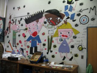
Besides "Lobotomy of San Francisco," there were site-specific works that employed school appropriate materials like color construction paper. But if the materials were appropriate to the location, the subject matter seemed to deliberately push the boundaries, at least in one case. On one wall, Haberny utilized paper and cardboard cutouts and spray paint stencils to portray a school shooting.

Another wall was dubbed "Illville" and decorated with construction paper drug capsules. A third wall was hung with a few dozen small works: collages of cartoon characters and corporate logos, pencil drawings that verged on being mere doodles. It had a cumulative effect as an installation. With its added graffiti and steet detritus scattered about, it had the aura of a squatted artist loft, urban sensory overload.

"I love really radical work," said Haberny. "I get tired of walking into people's houses and seeing really conservative landscapes and snowflakes."

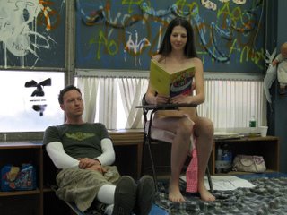
Haberny's school shooting mural was not the only stab at provocation in the Instrument Room. His friend Greg Wharmby—who told me, perhaps only half in jest, "You can call me Greg 'Master of Self-Expression' Wharmby"—staged a bit of "performance art" with a comely nude model, "Princess Caroline" (seen more demurely posed in photo, with Haberny).

It took the form of an improvised skit. Princess Caroline was playing the role of an artist's model. As Haberny documented the proceedings with a camcorder, Wharmby entered the room splattered with fake blood. According to Wharmby, "She's beautiful and the muse. He's covered in blood and is the villain." But then the scenario took an alarming turn as Princess Caroline went to light the fuse on some bottles that were taped together like a potential bomb. "What are you doing?!" exclaimed Haberny in mock alarm (as he continued videotaping).

"To draw audiences into it, I wanted to bring in the element of fear," Wharmby told me.

"Nudity makes people feel uncomfortable. Blood makes people uncomfortable. And when people start running, the catharsis occurs," said Wharmby.

"I'm hoping that the audience thinks, 'I don't know what this arbitrary bullshit is but I'll think about it,'" Wharmby added.

And if the provocation was aimed at CWOS organizers, they didn't rise to the bait. It was Live! Nude! Girl! in the Instrument Room, Building A, both Saturday and Sunday.

Saturday, November 04, 2006

Alternative Space: Short takes

City-Wide Open Studios
50 Orange St., New Haven, (203) 772-2709
Alternative Space: Short takes
Oct. 28-29, 2006.

Rashmi Talpade wasn't around when I stopped to peruse her photomontages. But, in lieu of having had a conversation with her about them, I can quote from her artist's statement. She was, she wrote, "building a new landscape out of fractions of everyday life that are harmonious but at the same time full of contradictions."

They were urban landscape collages assembled out of cut photographs. If not a commentary on overpopulation—although there were few if any people in them—they could have been. Almost chaotic abstractions, they offered a vertiginous assault of imagery in which the multitudinous different parts formed a coherent whole.

But the certainly aren't the sum total of her work. I flipped through her portfolio book, perusing page after page of ink line drawings. There were Escher-esque wood forms and fantasy art trees and dragons. I would have liked to as her about the process by which she goes from one artistic approach to another.

•••

Ben Westbrock's acrylic on board works were influenced by time spent in San Miguel de Allende in Mexico. Westbrock has been down there for 2—3 months a year for at least the past five or six years, he said. He has been doing some cacti drawings and wall pieces in clay from cacti. Cacti forms made appearances in both his multi-paneled work and in a separate painting.

"There's something about Mexico—its light, its energy, its people—that's very powerful," Westbrock told me.

•••

"Are you feeling brave?" That was the question Ellen Hackl Fagan asked me. I had just finished entering data into her PowerBook G4 laptop for an arts-related experiment she was conducting.

Fagan was inviting visitors to sit down, listen to short music clips and then click on the color swatch that we thought best correlated with the music we had just heard. She was constructing, she said, a "color organ," making a correlation between color and sound, "building the palette and data." I listened to excerpts of songs by Wilco and Frank Zappa, among others, and then clicked on what felt like an appropriate color selection.

The bravery was called for in the next step. Fagan had spectrum panels mounted on the wall. Would I sing notes to match different panels? Um, maybe, okay—now that everybody else has left the room. She picked up a camcorder to videotape me. Pointing to different panels I improvised sounds, mostly single notes although I scatted a little non-verbal riff to one color. Fagan said that certain colors predictably trigger a high or low note.

I was running out of time so I couldn't advance to the next step. Fagan was asking for musical responses to a series of multimedia panels. Unlike the monochrome spectrum panels, these emphasized texture and free-form abstract shapes. It was probably just as well that I had to go. These panels might have required me to sing chords, like Tuvan throat singers. They brought to mind Frank Zappa's quote, "You can't always write a chord ugly enough to say what you want to say, so sometimes you have to rely on a giraffe filled with whipped cream." And I didn't have a giraffe. (Which is not to say that the panels were ugly, just that they deserved more than a major or minor triad.)

•••

Mark and Karen Allen are a husband and wife artistic team. Mark does graphite aka pencil drawings derived from photographs by Karen. They were showing primarily street scenes—drawings of people walking through urban environments. The draftsmanship was very impressive. "Street Scene #1-Down Comes the Rain" was particularly notable for the way Mark Allen captured the blur of motion by the figure on the left.

•••

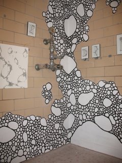
Craig Gilbert, a colleague from my days at the New Haven Advocate, was hanging out at the entrance to the showers in the girls' locker room. Dating back to his college days, Gilbert had doodled bubble-like imagery. So his location made sense in a non-creepy way.

"It's just a design that I've always doodled and it occurred to me to blow it up and do it larger," he said. He was showing a number of abstract pen-and-ink drawings with the bubble forms. But he also had painted one of the corners with the bubbles writ large.

"I threw up the white and filled in the black acrylic paint [outlines] with a 1/4-inch brush," Gilbert said.

"Yesterday, I had at least a dozen different interpretations of what this is," Gilbert told me on Sunday. "People would come in and say, 'Oh, bacteria,' or a biologist would come in and say, 'Give me your email address so I can send you a picture of something that looks just like that.' 'Oh, sea foam, that's wonderful!' And people have come in and had spiritual explanations—how it's all connected.

"The maintenance guy came in and said, 'Soap bubbles in the shower. It makes sense,' and then walked out," said Gilbert.

Thursday, November 02, 2006

Correction: Ely House Opening This Sunday

I titled an Oct. 25 post "Opening Reception Ely House this Sunday." Which would have put the opening at Oct. 29, this past Sunday. That title was incorrect (although the date was correct in the body of the post).

The opening reception for 2006 Exhibition of Undergraduate College Artwork in Connecticut is this Sunday, Nov. 5, 2—5 p.m.

Be there or be square.

Alternative Space: Julianne Cote

City-Wide Open Studios
50 Orange St., New Haven, (203) 772-2709
Alternative Space: Julianne Cote
Oct. 28-29, 2006.

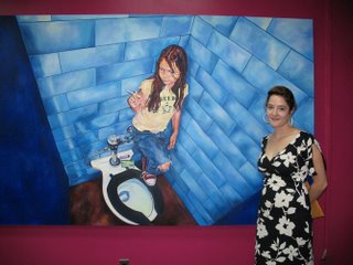
Julianne Cote was sent to the principal's office. Or perhaps she chose to be there. At any rate, Cote—who attended the old Hamden Middle School and recently obtained her Masters in Fine Art from the University of Colorado at Boulder—felt her Alternative Space location was appropriate.

"It's kind of funny that I'm in the principal's office, with that painting," she said, pointing to "Madeline." In the large painting, a young girl defiantly smokes a cigarette in a lavatory stall.

Cote works from photographs, painting with acrylic and oils. She prefers to paint on wood but does the occasional canvas as well. The work she was showing in the principal's office was part of her Master's Thesis show.

The subject matter was voyeuristic—paintings of women using the toilet—or a comment on the voyeurism of looking at art. In some cases, the woman smiles and looks directly at the viewer. In others, the viewpoint is looking down at the woman, like peeking over the stall divider.

Cote foregrounds the issue of voyeurism in many cases by adding an element of viewer interaction. Louvered blinds hanging in front of the work can be opened or closed. In fact, she incorporated the office window blinds into her display by putting a couple of paintings behind them. One work had mirrored blinds so that, depending on how they are oriented, we can "see into" the bathroom or see ourselves looking.

"It's the nature of us as individuals to want to look at something we're not supposed to look in on," said Cote. "It's something that might be banal. I like to beautify that. You can interact with it. You can open and close and control your view of the painting."

Alternative Space: Robert Greenberg

City-Wide Open Studios
50 Orange St., New Haven, (203) 772-2709
Alternative Space: Robert Greenberg
Oct. 28-29, 2006.

Many of you have seen one of Robert Greenberg's works but not known it. Familiar with the painting of the big tree frog in the window of the Acme Building on Crown Street in New Haven's Ninth Square? That's his. But the work he was showing in one of the big rooms off the gymnasium at the Alternative Space was quite different.

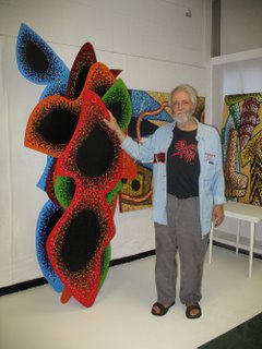
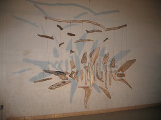
Greenberg, who maintains studios in New Haven and New York, displayed a number of large mobiles from his Ancient Aquatic series. With the room lights low, he suspended sculptures made out of driftwood. He set industrial lights on the floor so the works cast shadows on the dirty white cinder block walls. Greenberg also set up fans to propel the mobiles into gentle motion. They resembled fossils, and the shadows reminded me of phantoms.

"I love Calder's work. It's a big influence. And I also love Robert Rauschenberg. I put found object and kinetic sculpture together," said Greenberg.

Greenberg's New York apartment is near Riverside Park. He walked down to the Hudson River one day and saw the wood and brought it back to his apartment. (A slide show included images of him pushing a grocery cart loaded up with bleached driftwood.) He arranges pieces out on his 18th floor balcony and then goes up to the roof of his building-the 24th floor-and photographs it. He scans the photo into his computer to formulate the piece. For smaller pieces, Greenberg uses monofilament, or fishing line, to connect the disparate components. Larger works are held together with 49-strand stainless steel shark leader. (They have to be strong enough so if a child tries to swing on them, they hold together.)

"There are two influences to these pieces. When I was a kid, I would go to the Peabody Museum. There was [the fossil of] a giant turtle up on end. As a child, I loved that turtle," said Greenberg. The other influence was a "giant totem pole they used to have at the West Rock Nature Center."

"When I find these things, they look like bones to me. And when they blow in the wind they become animated," Greenberg said. "I don't think Calder used shadows as much." He noted that the shadows change, becoming more defined as the wood rotates closer to the wall, and more diffuse as it rotates away.

He doesn't name them individually.

"I just see them as these creatures that came from the ancient Hudson," said Greenberg.

Wednesday, November 01, 2006

East Neighborhood: Christopher Mir & Karen Dow

City-Wide Open Studios
50 Orange St., New Haven, (203) 772-2709
East Neighborhood: Christopher Mir & Karen Dow
Oct. 22, 2006.

(Note: Somehow, this post written last week was never posted. So I'm going ahead and posting it now. HH)

Last stop of the day was at the home of Christopher Mir and Karen Dow. Their shared studio is in a freestanding building behind the house. Dow had a solo show last month at the Bellwether Gallery in New York City. Mir is finishing up a series called Second Sight for a solo show that will open at the Rare Gallery in NYC on Nov. 11.

He has seven done and plans to do two smaller ones this week.

"There is only room for six paintings. But I want some extras for the rack, and some to choose from when arranging the show because you never know how they will play in the big white cube," he told me.

Mir said his subject matter has intrigued him since high school. He is interested in "dreamscapes like a natural history diorama—but with a lot of room for play. It's the Garden of Eden or the Apocalypse."

"The bulk of the Western painting tradition has been figures and the landscape. What can I add to that mix?" said Mir.

He starts with the landscape and then adds characters, drawing on some basic archetypes. There is the Venus or Demeter goddess figure. Primal man "like a Jesus/hippie/Charles Manson guy" or an aboriginal man. A warrior. Mother and child. "There's a spirit guide or animal in pretty much every painting," said Mir. For themes, Mir mines anthropology, myth and mysticism, poetry and Biblical imagery.

"There has to be a technological menace," He said, pointing to an SUV entering one image. "An SUV coming in, or power lines or a corporate headquarters." Fears of global warming or the fragility of the world. Or, conversely, "something magical—crystals."

I was intrigued by the way out plants in the painting "Second Sight." Were they a particular type of plant, I wondered, or something he conjured in his imagination? It is a cactus forest in Madagascar, according to Mir.

"There all from photographs that I find. I'm mining the image world all the time," he said. He buys a lot of coffee table books on national parks and uses Google image search. In fact, typing the phrase "twisty tree" into Google turned up an image that became the centerpiece of the painting "Mortal Mirror."

Dow also works from images. She paints seemingly abstract geometric forms in acrylic on wood panel. I've always liked her paintings but never really "got" them until I spoke with her this past Sunday. She looks for photos in design magazines, often of interior spaces. She then "flattens out" the space.

"It's like a still life but I'm not setting up the still life. I'm finding it," Dow explained. She takes "compositional cues and palette cues" from the images. By way of example, she shows me a magazine image of a girl in a red tunic and white skirt. When I look at a postcard of the painting derived from the photograph, I see the reference.

And this is one of the things I like most about CWOS—the opportunity to talk with artists about their inspiration and approach and gain a deeper appreciation of their art.

Alternative Space: Kelly Bigelow Becerra; Karen Klugman

City-Wide Open Studios
50 Orange St., New Haven, (203) 772-2709
Alternative Space: Kelly Bigelow Becerra
Oct. 28-29, 2006.

Overheard conversation:

Artist's friend: "People are saying 'the little girl's room is adorable!'"

Artist: "Is that the word on the street?"

Artist's friend: "They might be referring to the girl's restroom but I don't think so!" Laughter.
The so-called "little girl's room" was Kelly Bigelow Becerra's relief paper sculpture installation aka "Harvest: Hidin' from the Hair Cut, Amongst the Sweet Corn." The installation, which looked like an old-fashioned sampler writ large, was made with scanned objects, archivally digitally printed. It also included a multi-media component, a soundtrack combining bird sounds with old time country and gospel music.

The music that was playing was "very specific: Gene Autry, early country, early gospel, the kind of thing I grew up with." Her grandparents, said Becerra, were "hardcore country."

"All my work is about my childhood growing up in the Midwest," said Becerra, who lives in the Bridgeport Artspace Building. She also has her own blog.

"I actually researched the birds" on the soundtrack, she said. "All the birds are really from Michigan."

"I think scans are more honest in some way than regular photographs," she said. "If you put your hand on the scanner, it neutralizes it all and lets me have the raw information. There are less variables, a shallow depth of field." She said she had actually scanned a tractor over the summer, part by part.

(Are scanners catching on as an artist's photographic tool? Photographer Karen Klugman, who wasn't in her room when I stopped by, also used a scanner to capture detailed images of flowers and dead bugs. A posted sign reassured viewers that the bugs were found dead, not dispatched for the glories of art.)

"When I make a composition in the computer, they are multi-layered. I can move the pieces around," said Becerra. By making sculptures rather than flat montages, she can obtain a sense of depth similar to that in Photoshop.